🌐 Overview
My role 👨🏼💻
Discovery and research
UI / UX design
Supervising junior designer
QC
The problem 🤔
Alesco needed a style update to celebrate their 15th anniversary in 2023. The redesign should enhance its global visibility, align with group security requirements, and support growth plans, including a successful marketing campaign targeting independent brokers.
Deliverables 📦
Figma component library
Style guides
Specifications
The solution 🌟
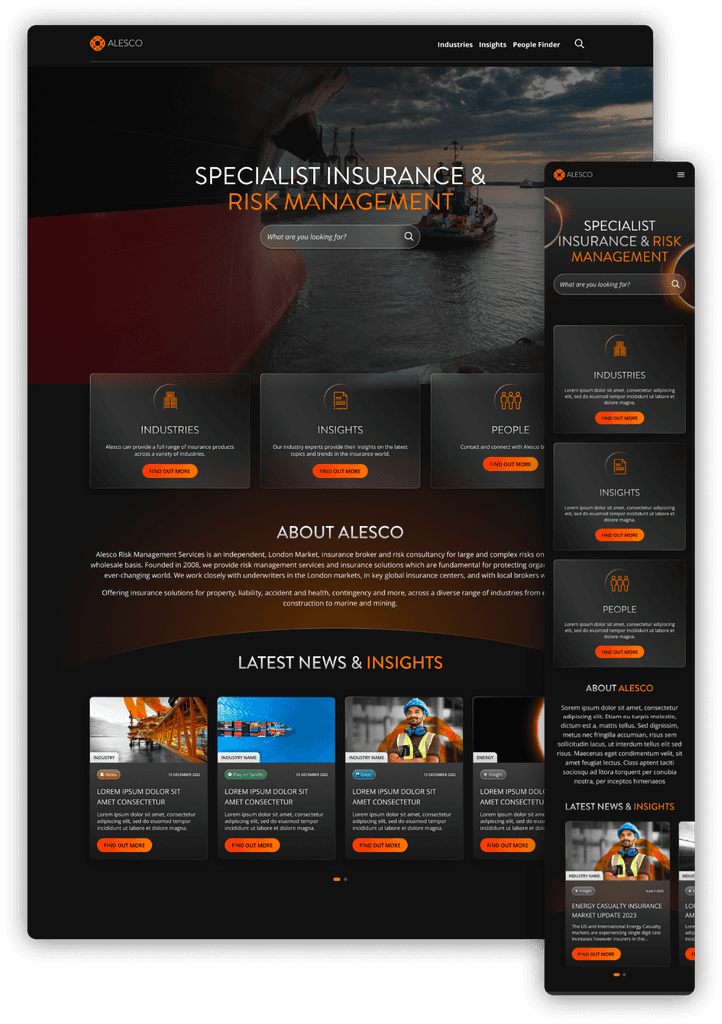
Developing a fresh component library featuring a contemporary, dark user interface inspired by their latest rebranding. The News & Insights and People Finder sections have been revamped to simplify broker discovery and communication, and to establish a content hub to raise awareness of the team's expertise.
🎨 Design process
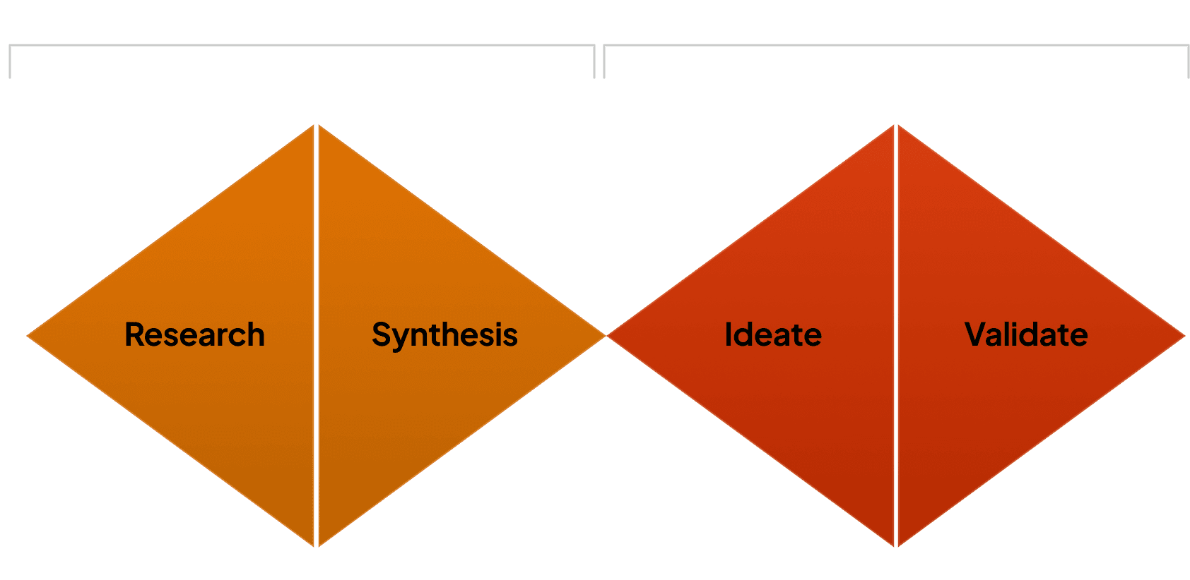
In order to make the portal as seamless and user friendly as possible, we went through four different design stages.
🔍 Research & Discovery
Who are Alesco?
Alesco Risk Management Services is an independent, London Market, insurance broker and risk consultancy for large and complex risks on a direct and wholesale basis. They work closely with underwriters in the London markets, in key global insurance centres, and with local brokers worldwide.
They offer insurance solutions for property, liability, accident and health, contingency and more, across a diverse range of industries from energy and construction to marine and mining.
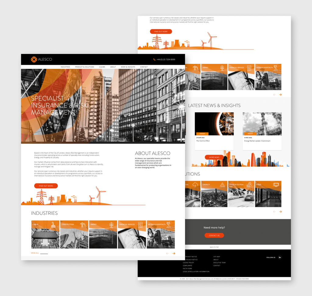
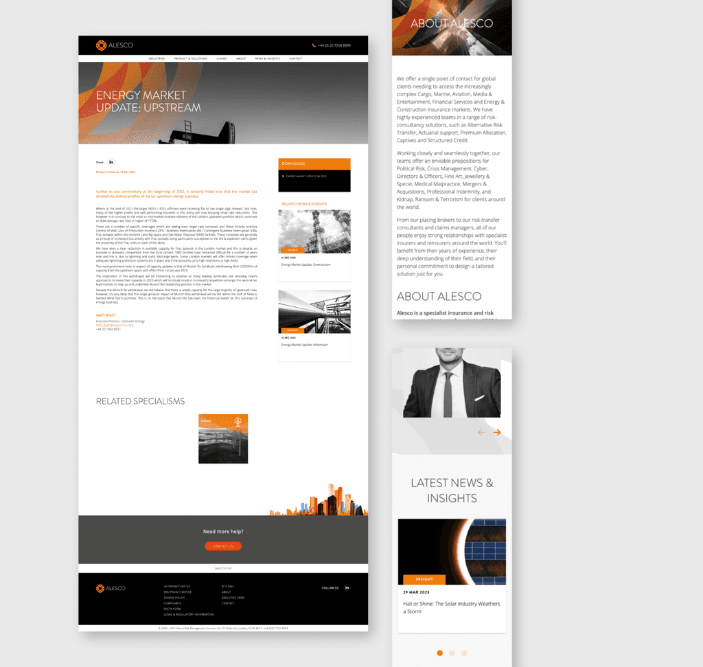
Original website
In order to gain insight into the organisation and their services, I examined their existing website. Through this, I was able to assess the present information structure and brand design, giving me a clear understanding of what we'll be improving.
Rebranding
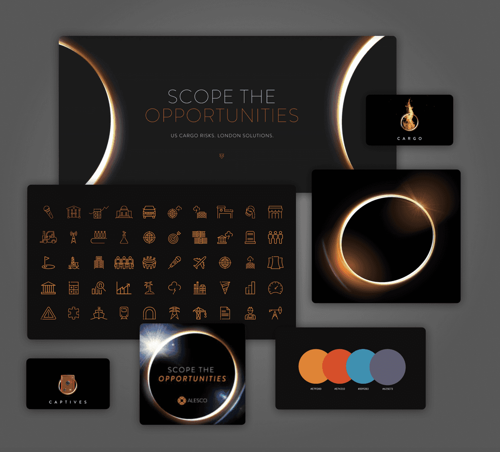
Alesco hired an agency to handle their rebranding efforts, transitioning from monochromatic visuals toward a contemporary, darker look. A significant addition to their brand identity is the 'light ring' that is incorporated into various design components.
Stakeholder interviews
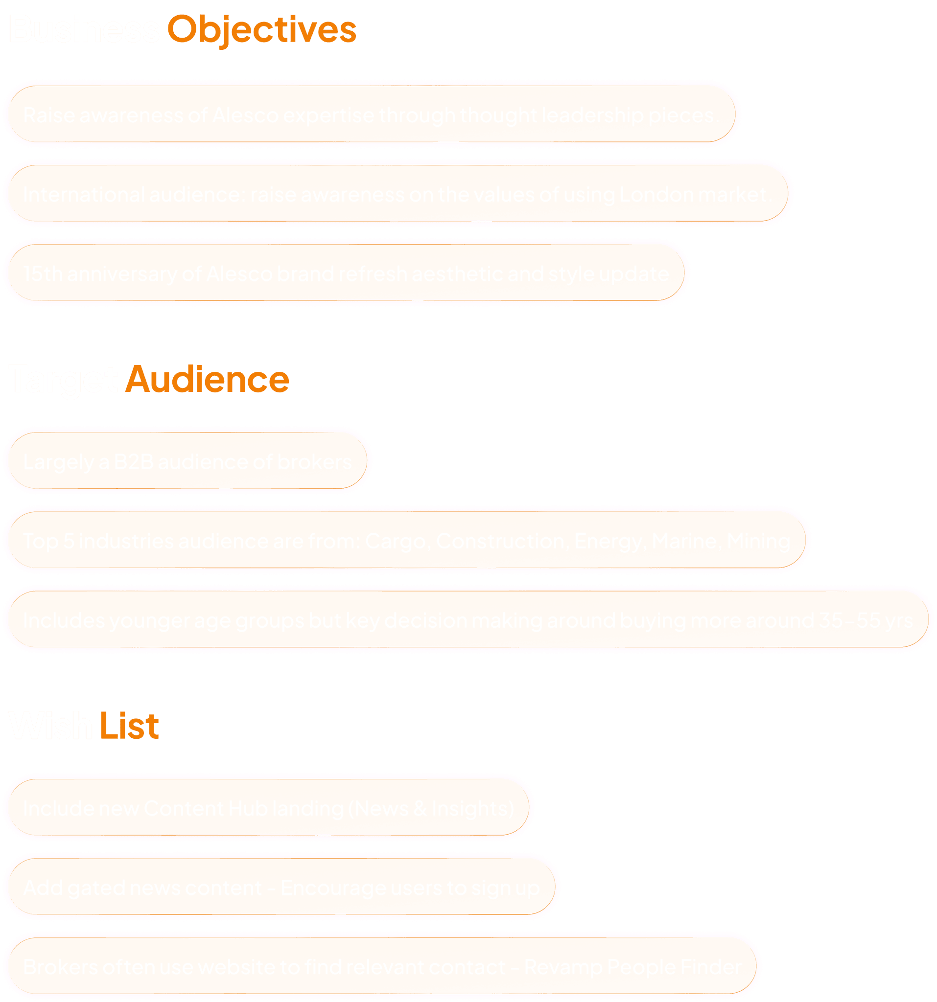
In order to learn more about the business, their objectives, clients, and the problems they are facing with their current site, I conducted interviews with key stakeholders. Form this I was able to understand what we were trying to achieve for their business and users.
📝 Define
To better understand Alesco's audience and what they'll be looking for, I created proto-personas based on the our stakeholder interviews and research. Their audience are primarily North-American brokers, with the majority specialising in Cargo and Marine, Construction, Energy, Mining. They are split approximately between 30% Wholesaler, 70% Retailer.



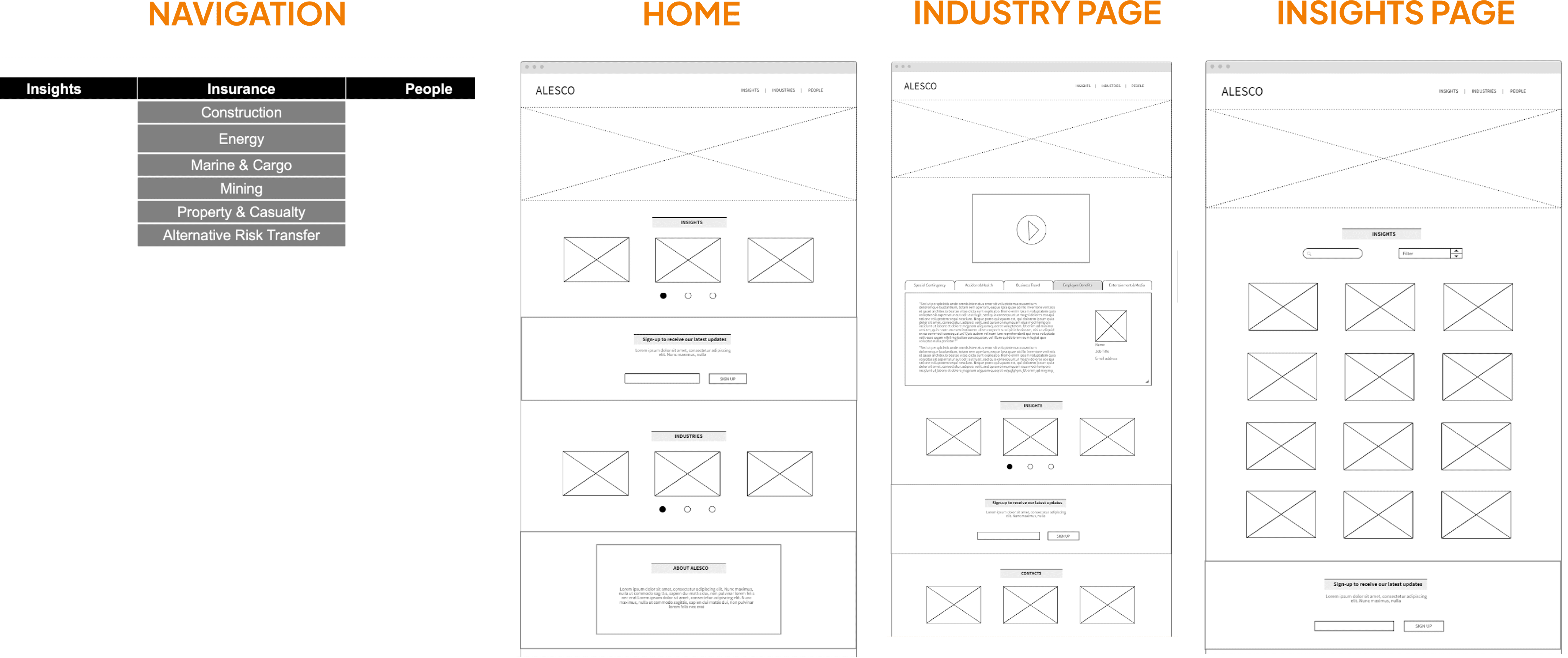
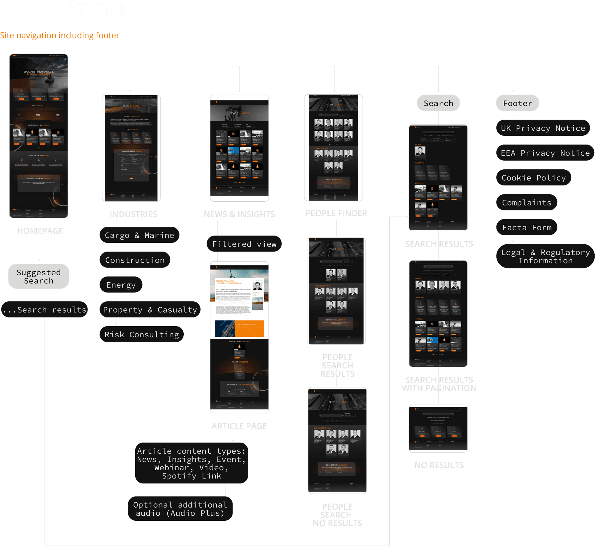
How is the site going to be structured? Mapping out the information architecture and navigation
To better visualise how the website is going to be organised and ensure it makes sense, the information architecture and navigation was mapped out.
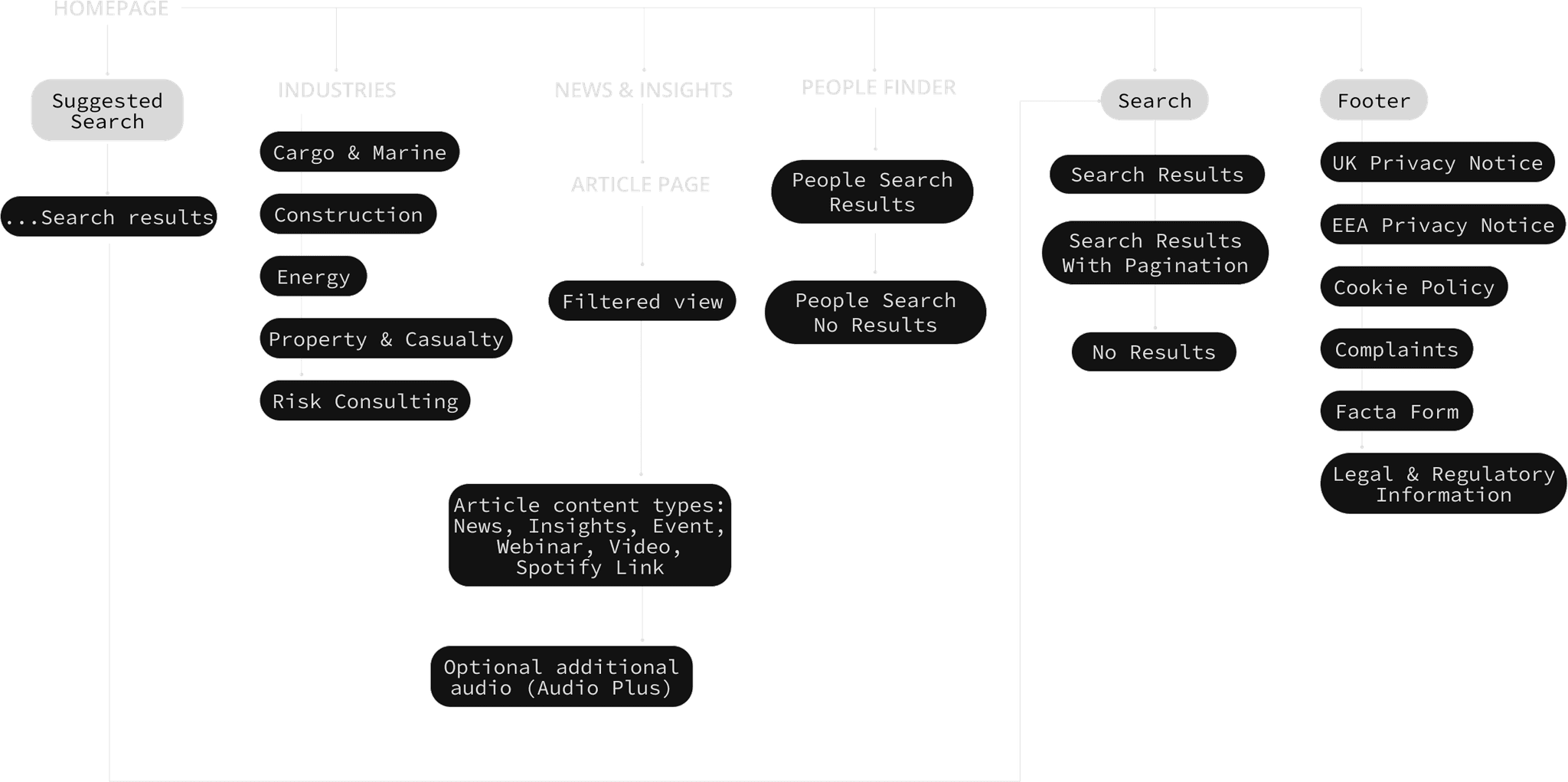
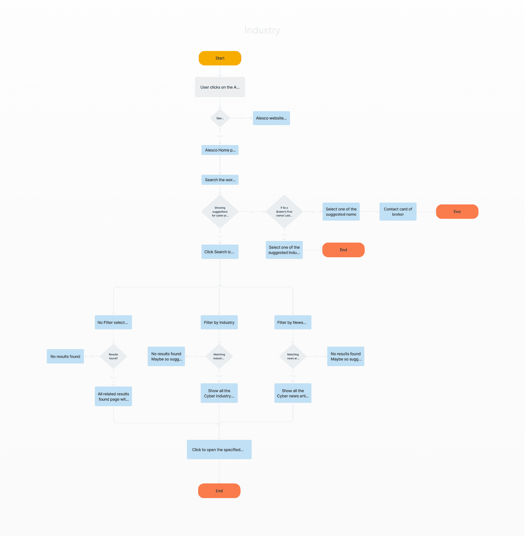
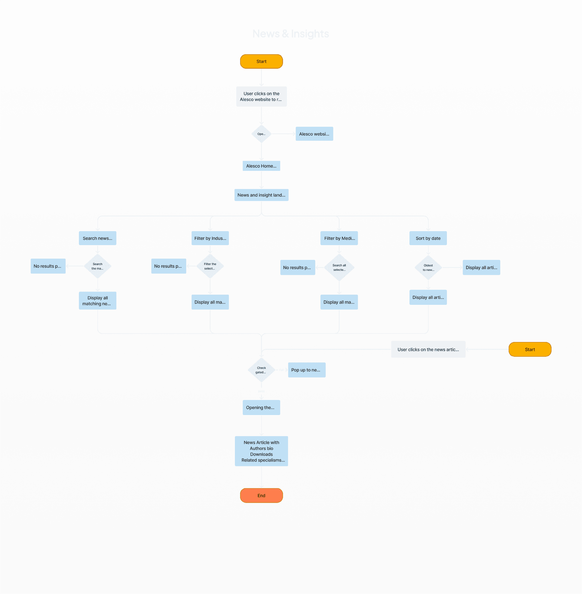
Let's see how the user journeys are going to look
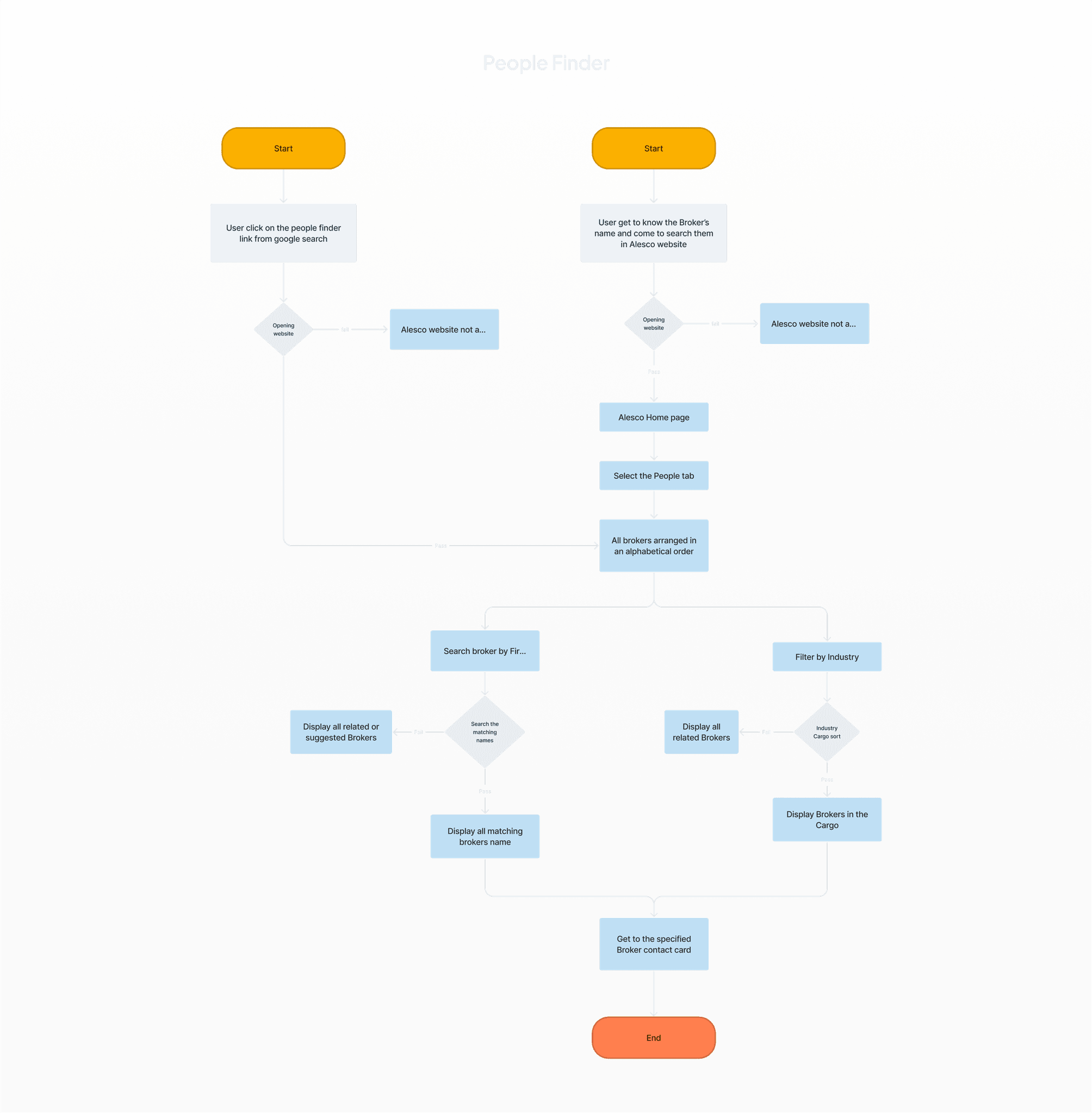
I supervised a junior designer to map out the user journey in order to get a better understanding of how users are going to find what they are looking for, . Users could be coming from different places and want to achieve different goals, so it was important to map out a few different scenarios.
🛠 Develop
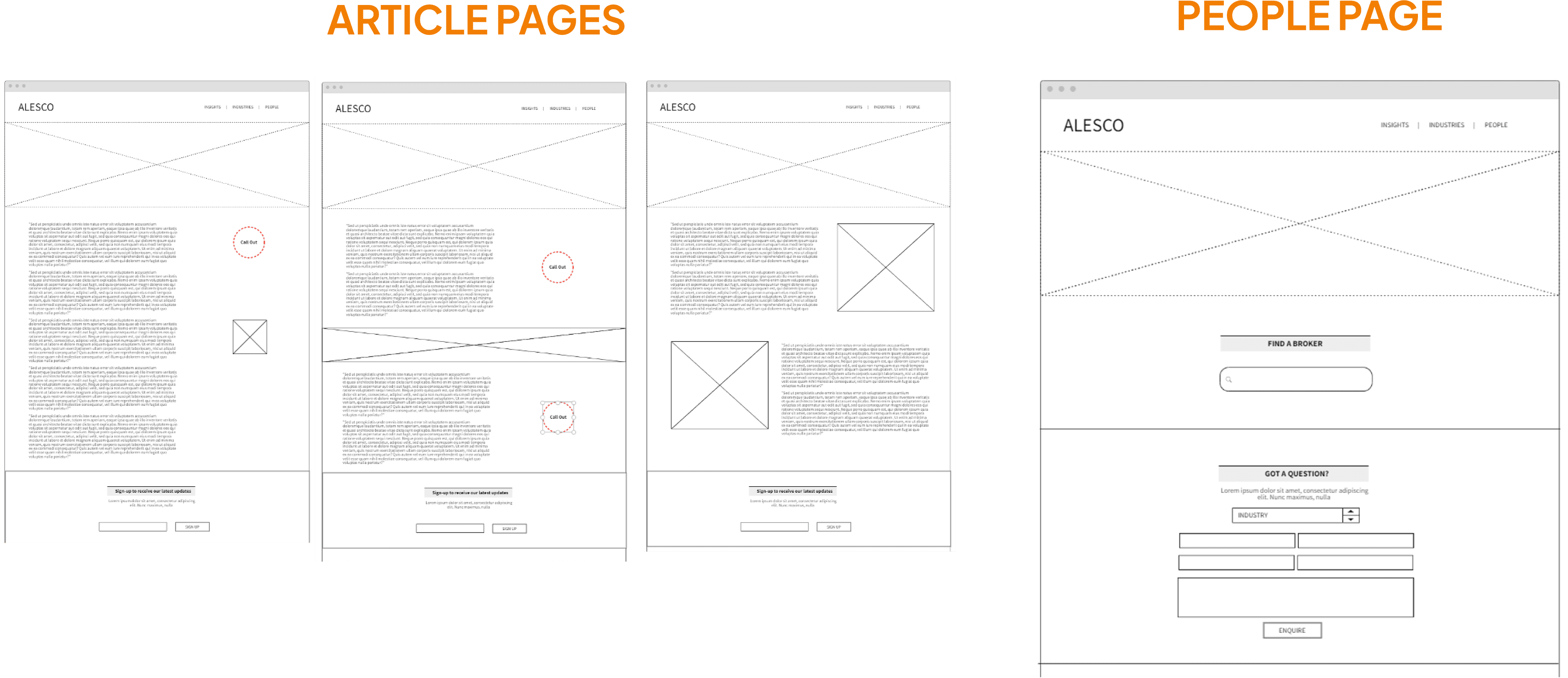
What do we need on each page and how are they going to be structured?
By making use of low-fidelity wireframes, we could quickly determine the necessary components for each page and establish the information hierarchy.
Time to build out our component library
Using Figma, we started working on designing their new aesthetic based on their rebrand and created a new component library.
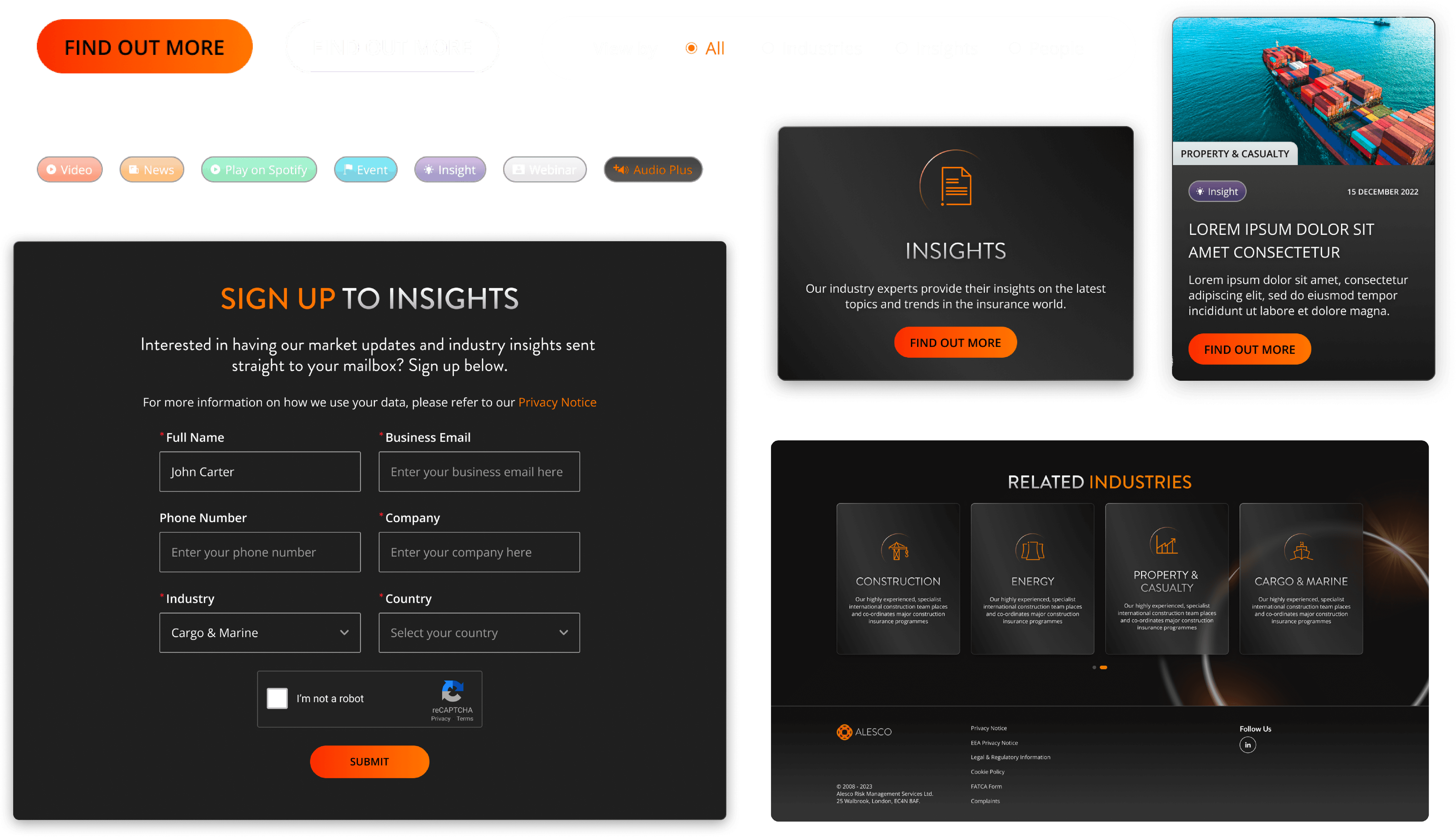
Ensuring the UI is accessible
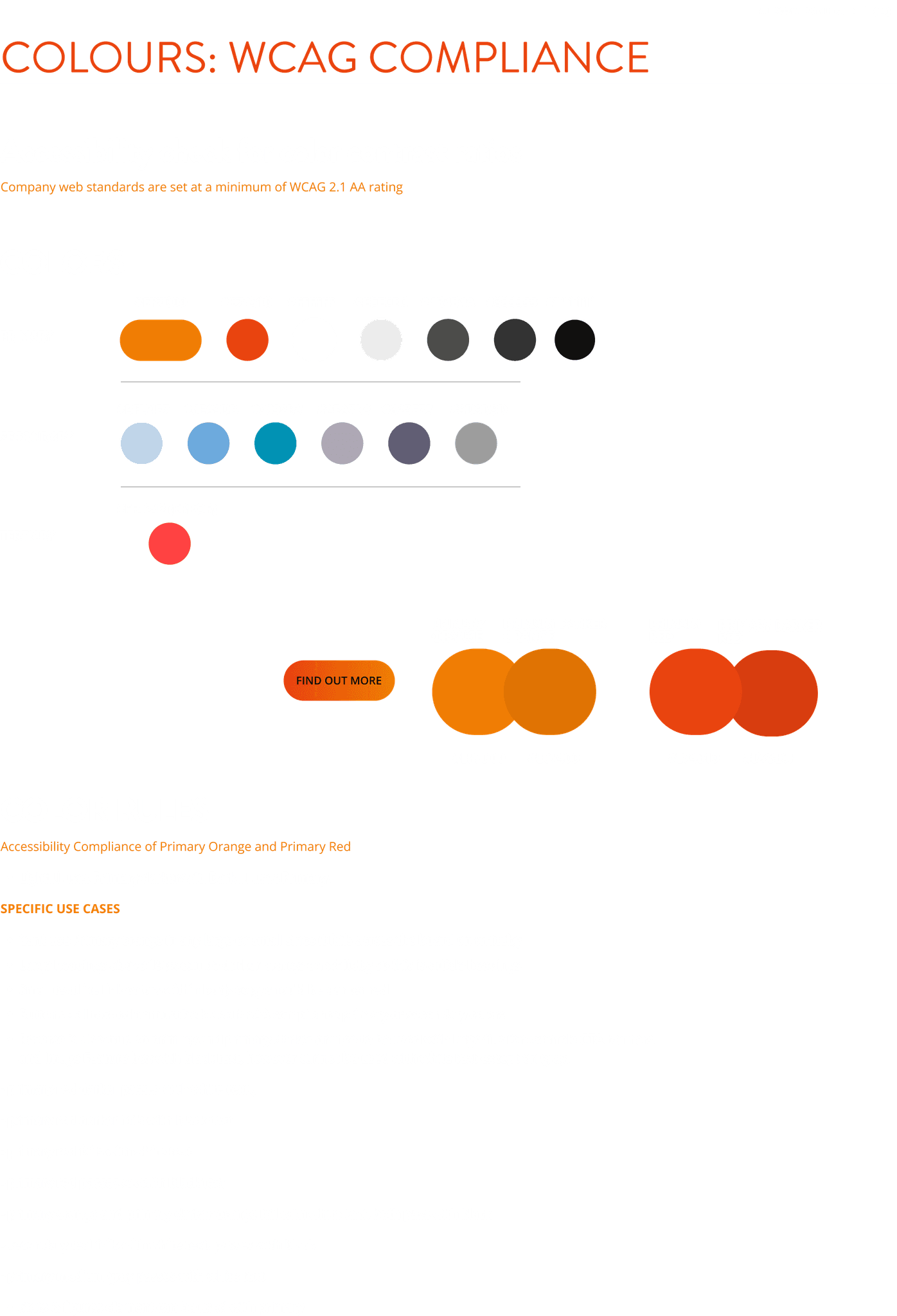
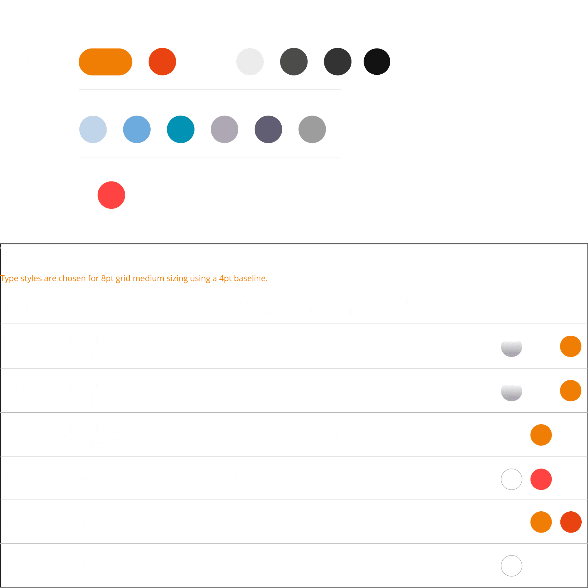
Extra attention was paid during the UI design process to guarantee that all elements met or exceeded WCAG 2.0 accessibility guidelines. As part of this effort, we made slight adjustments to Alesco's color scheme to improve text contrast. We ensured that the business and development teams were informed of any contrast modifications and guidelines.
🚀 Deliver
Screen designs
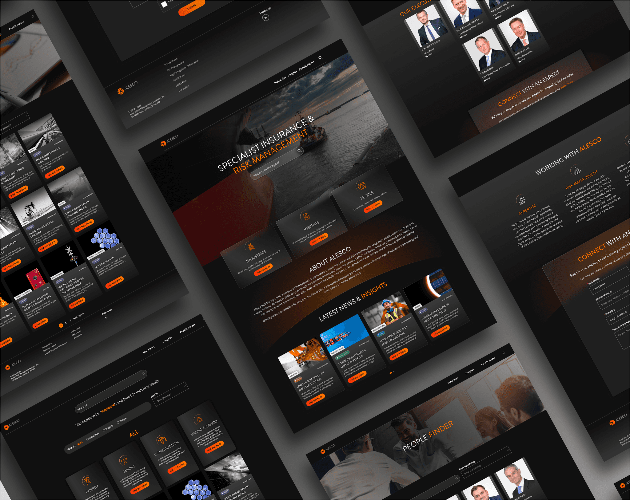

Developer style guide
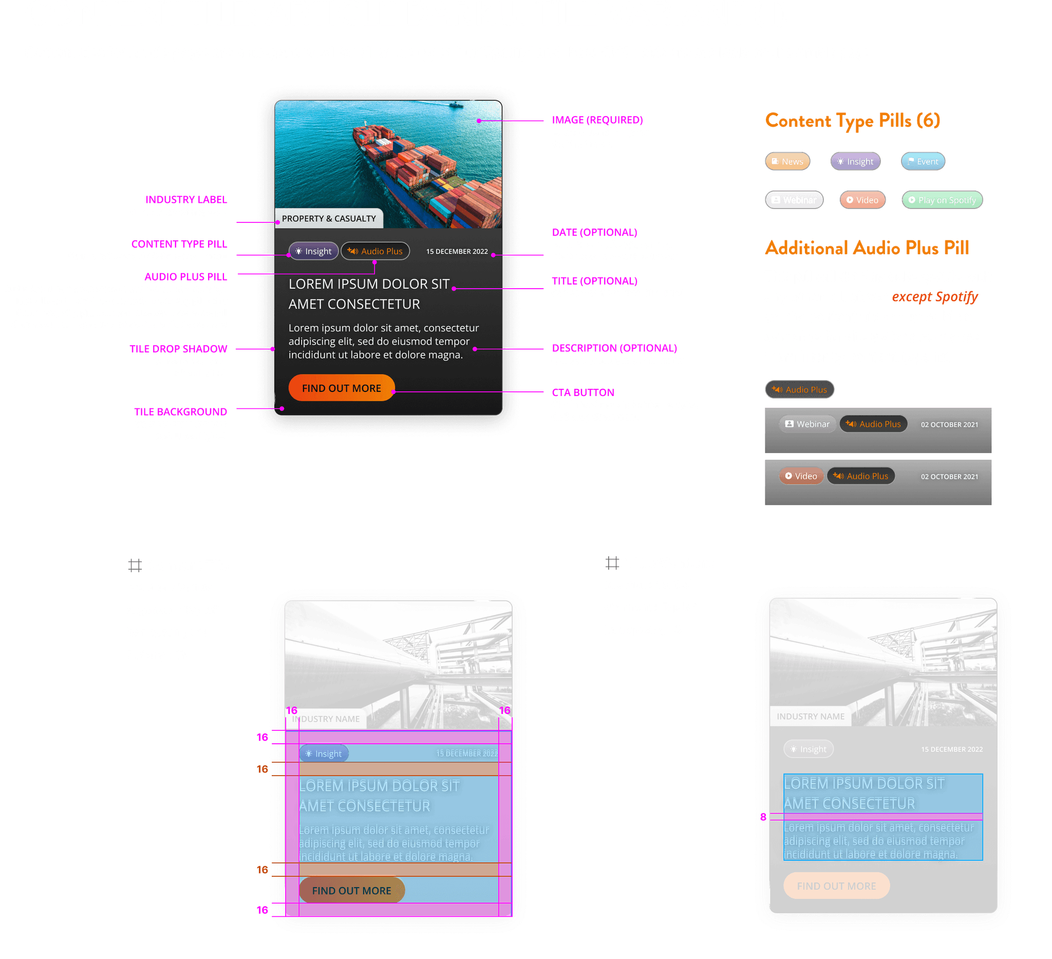
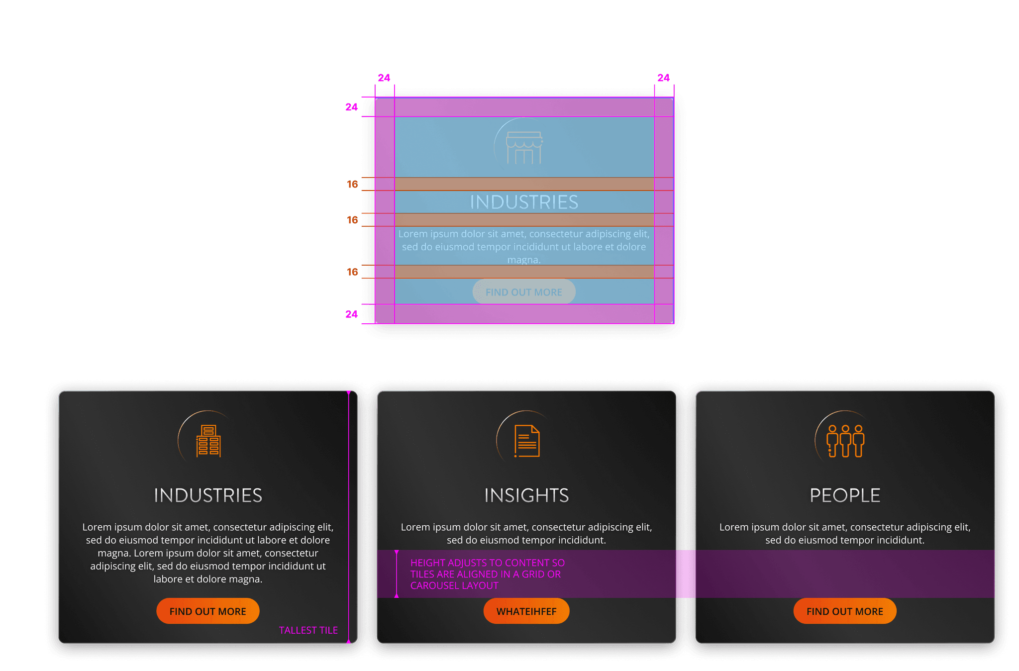
Once the designs were finalised, a comprehensive style guide with colours, fonts, dimensions and layouts was provided to developers, followed by a walk-through and Q&A.
Our Challenges
One of the main challenges for developing a dark UI with glassmorphic design was ensuring accessibility. This was something that had to be considered from the ground up and involved a lot of iteration.
Feedback
Feedback from the project was positive, with Alesco's team liking the dark UI and modern aesthetic.
What's next?
So far the project has been successful, seeing much more traffic being driven to the People Finder, meeting one of Alesco's key business goals. A light UI version is also currently in development which fits closer with the global brand.
