🌐 Overview
My role 👨🏼💻
Lead designer
Discovery and research
UI / UX design
QC and front-end developer supervision
The problem 🤔
Insurance clients were facing limitations in paying invoices as they could only process payments over the phone during working hours. This created inconveniences for both clients and the organisation. The process of reconciling allocated cash with outstanding payments is cumbersome and time-consuming, leading to potential discrepancies.
Deliverables 📦
High-fidelity Figma prototype
Style guide
The solution 🌟
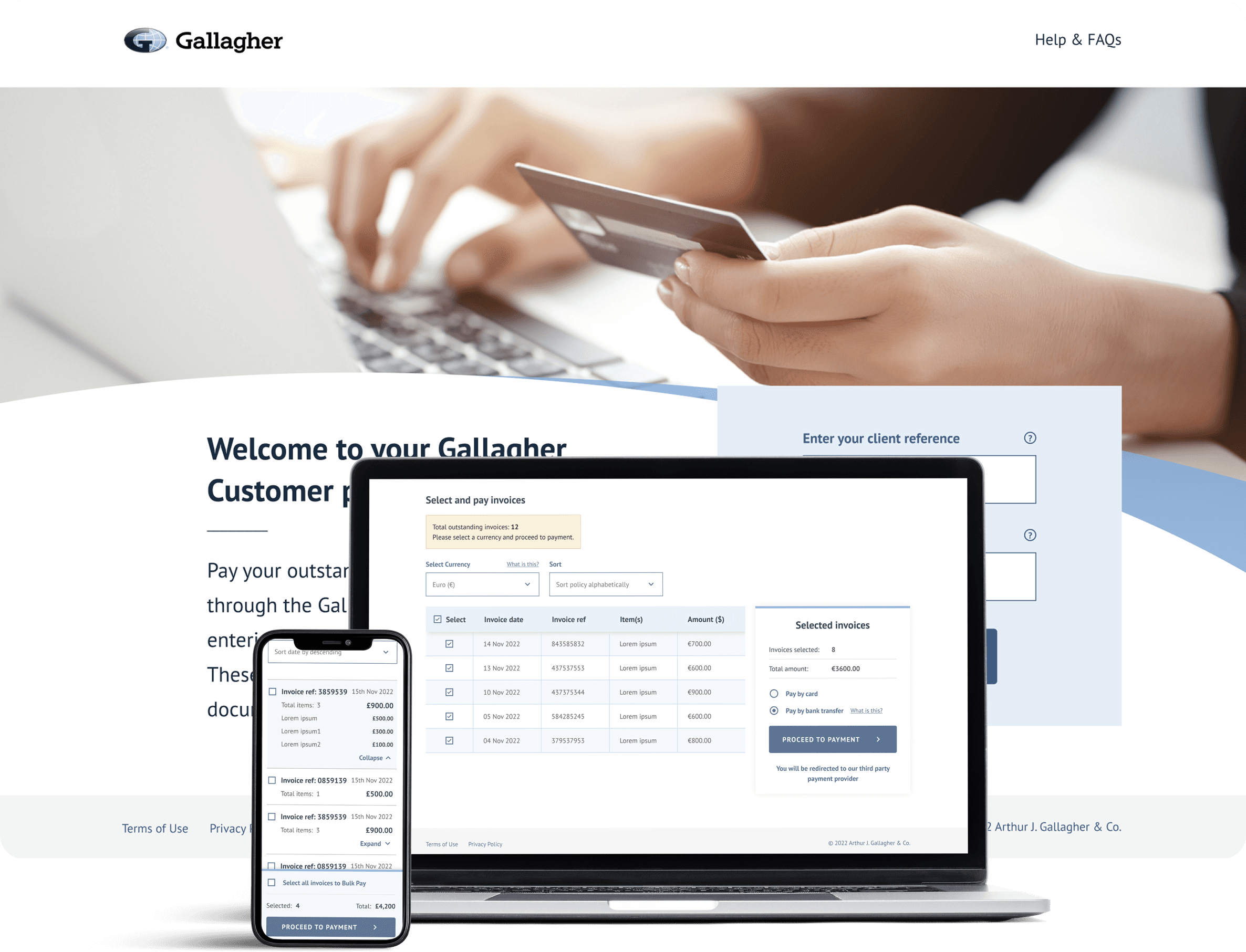
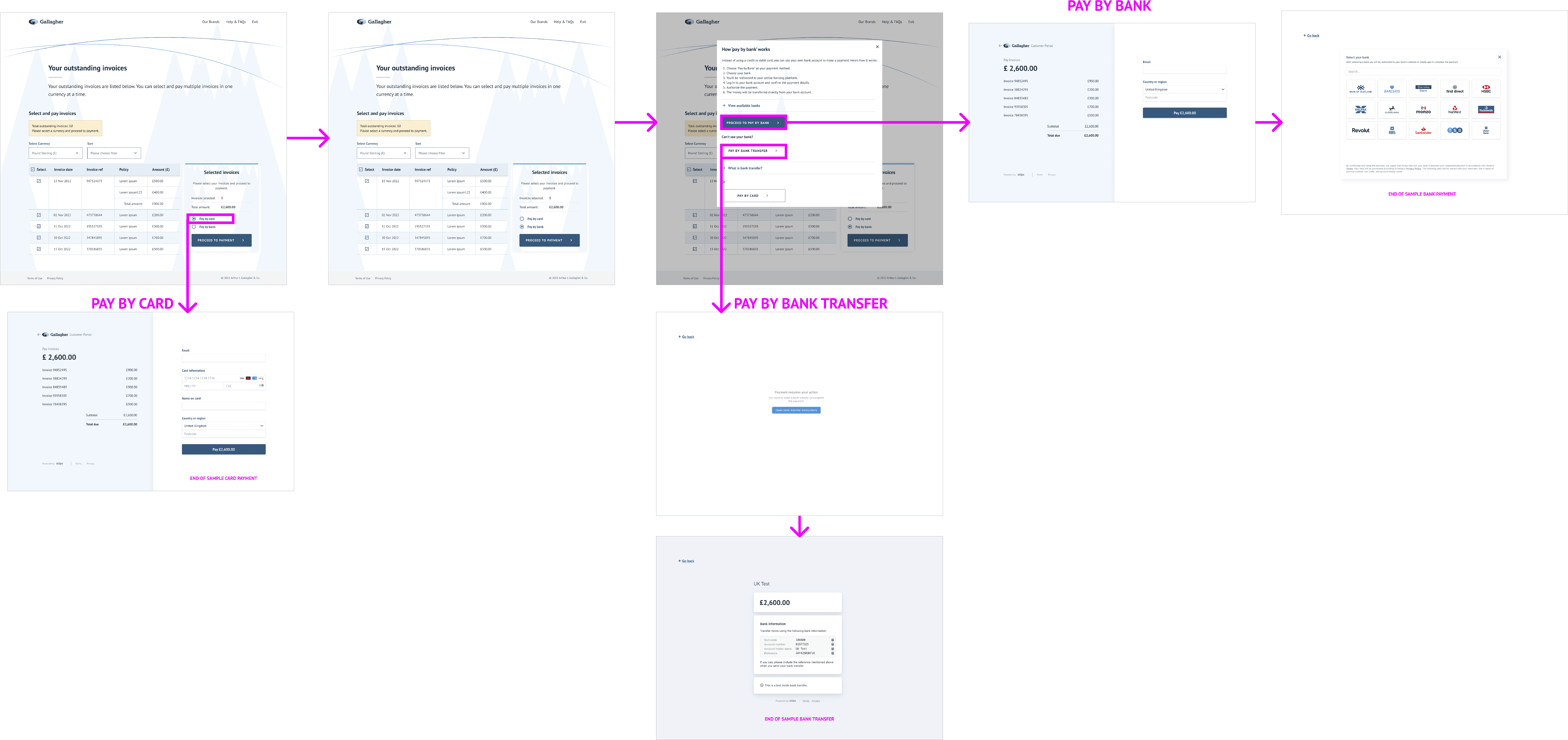
An online payment portal that clients will be able to access 24/7 to make payment by credit card or bank transfer. This reduce the unallocated cash and improve the customer journey. This is achieved by ensuring clients can only pay amounts due to the correct bank account via the portal.
🎨 Design process
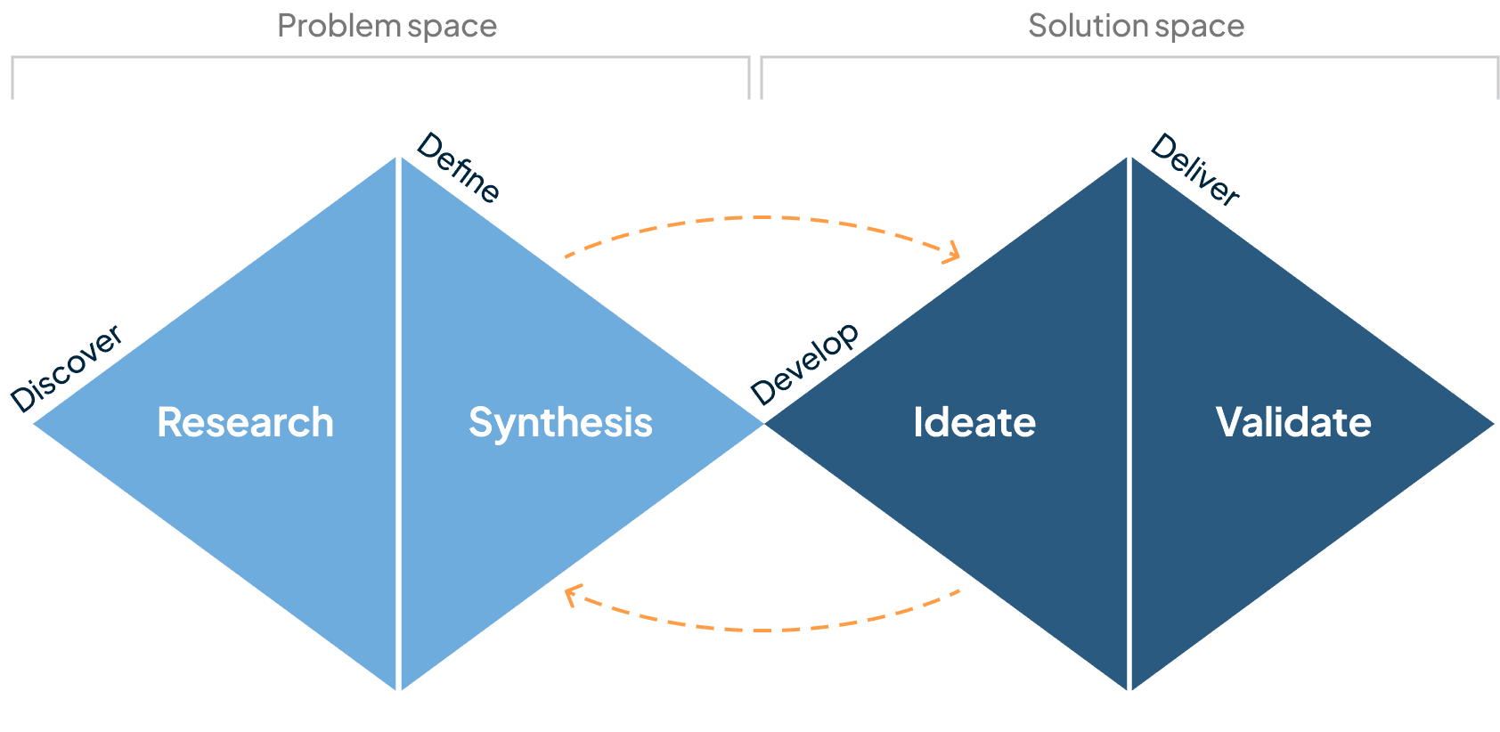
In order to make the portal as seamless and user friendly as possible, we went through four different design stages.
🔍 Research & Discovery
Who are the business and what do they do?
The business is part of Gallagher, an Insurance Broking organisation. They service from various different industries and sectors and many of their sub-brands
Let's get talking and start learning
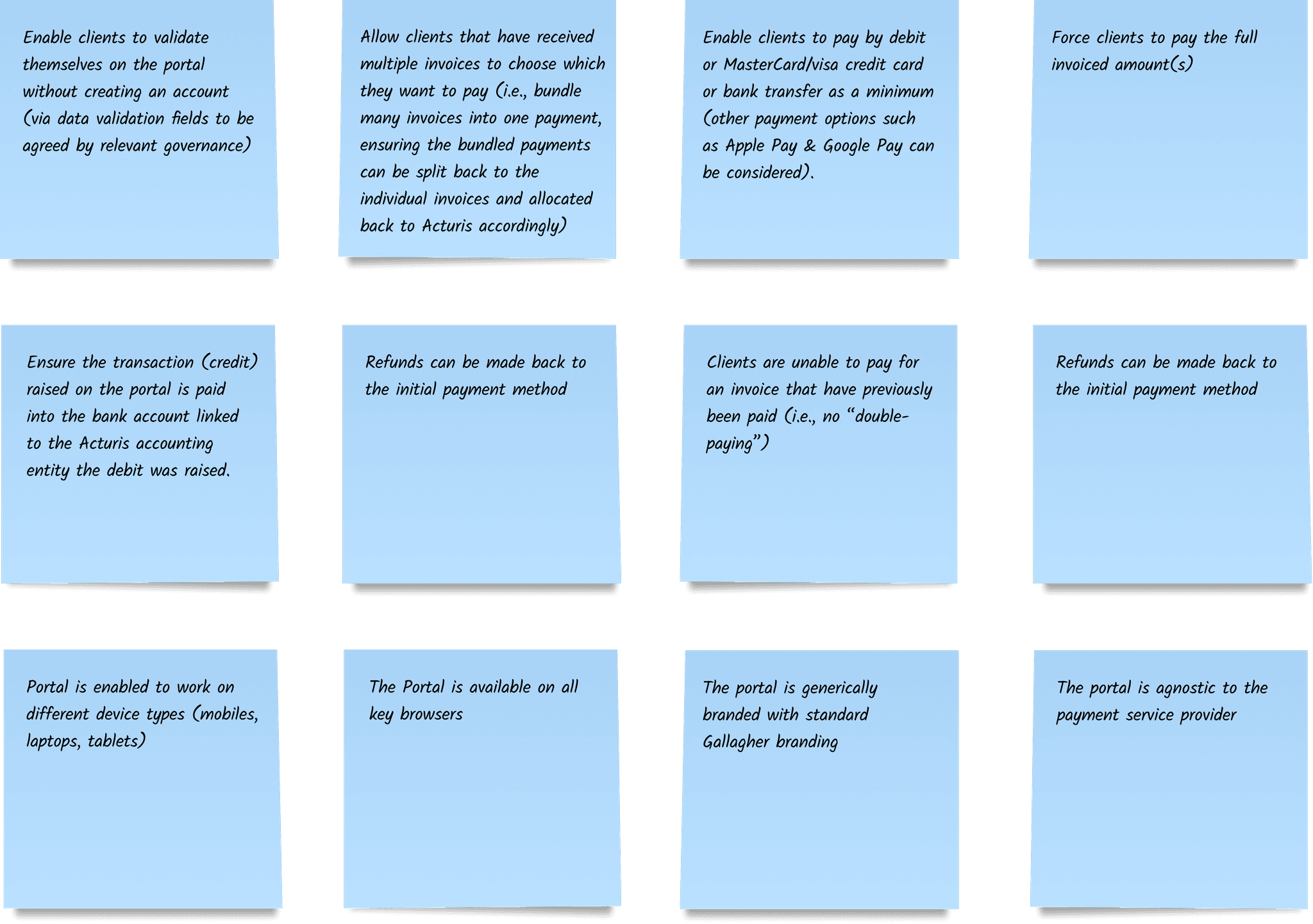
In order to learn more about the customers, the business, and the problems they are facing, we conducted interviews with key stakeholders. A major pain point experienced was providing inaccurate payment details. Clients frequently encounter difficulties while inputting the right information, resulting in errors such as incorrect reference details or payment amounts.
A common occurrence is clients using vague references like "insurance" during transactions, making it challenging to associate payments with specific invoices and clients.
Customer pain points 🤕
Wish list ✨
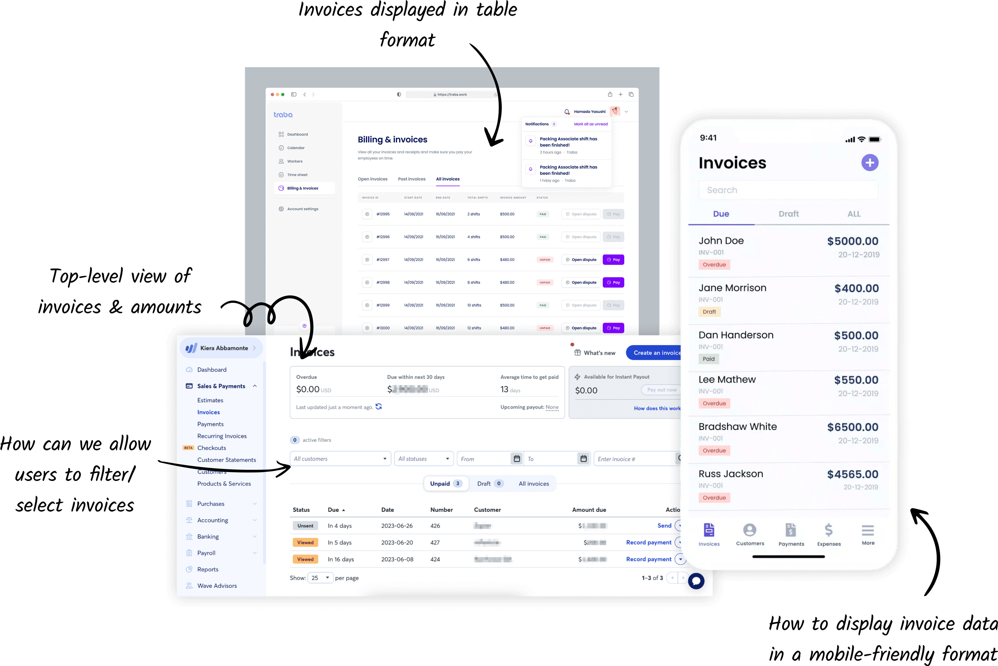
Let's see what we can learn from other invoicing applications
To gain a deeper understanding of invoice portals, I examined other applications and how they approached similar problems. This helped with the development of feasible solutions in the UI and user flow.
📝 Define & Synthesis
In a nutshell, how's it going to work?
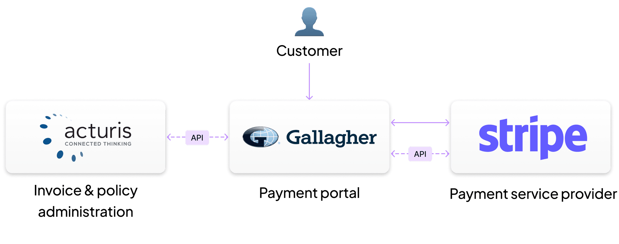
The portal doesn't store any data, and instead acts as a "middle-man" between the policy administration software (Acturis) and the payment provider (Stripe). The systems communicate through API's to validate customer details, transfer necessary invoice data and reconcile payments.
Time to get technical. How is everything going to work together?
A process flow diagram was created in collaboration with the architects to illustrate how the different systems will work together - from a debit being raised to the reconciled payment. This also helped us to identify and look at how to handle potential failure stages, such as the customer providing incorrect information or payment failures.
What are the potential failure stages?
1. Customer provides incorrect information
2. Page fails to transfer the customer to the Payment Service Provider
3. Payment fails on Payment Service Provider site
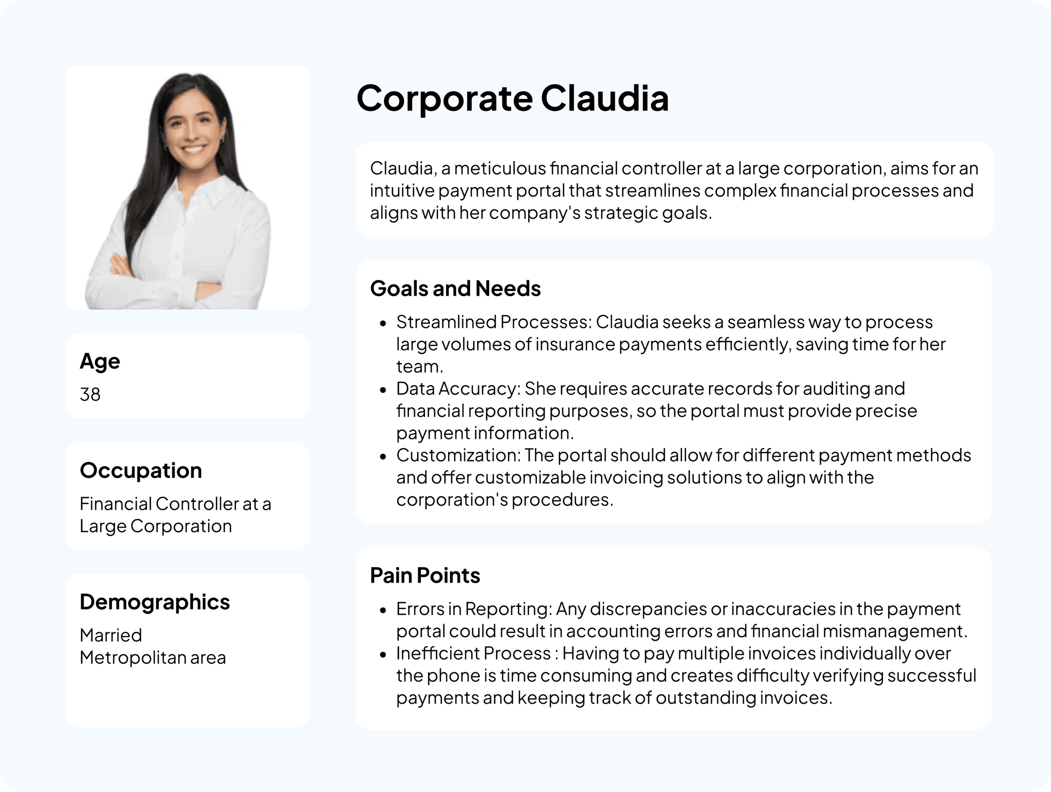
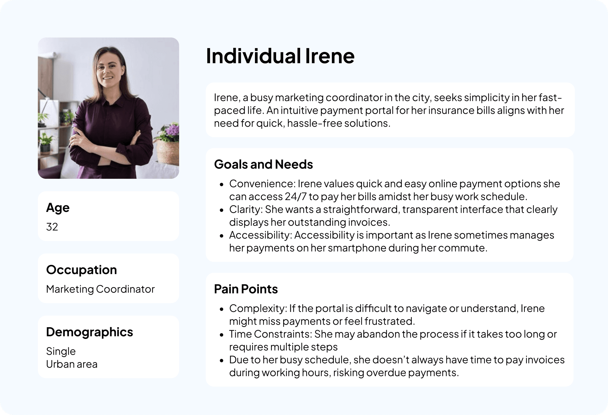
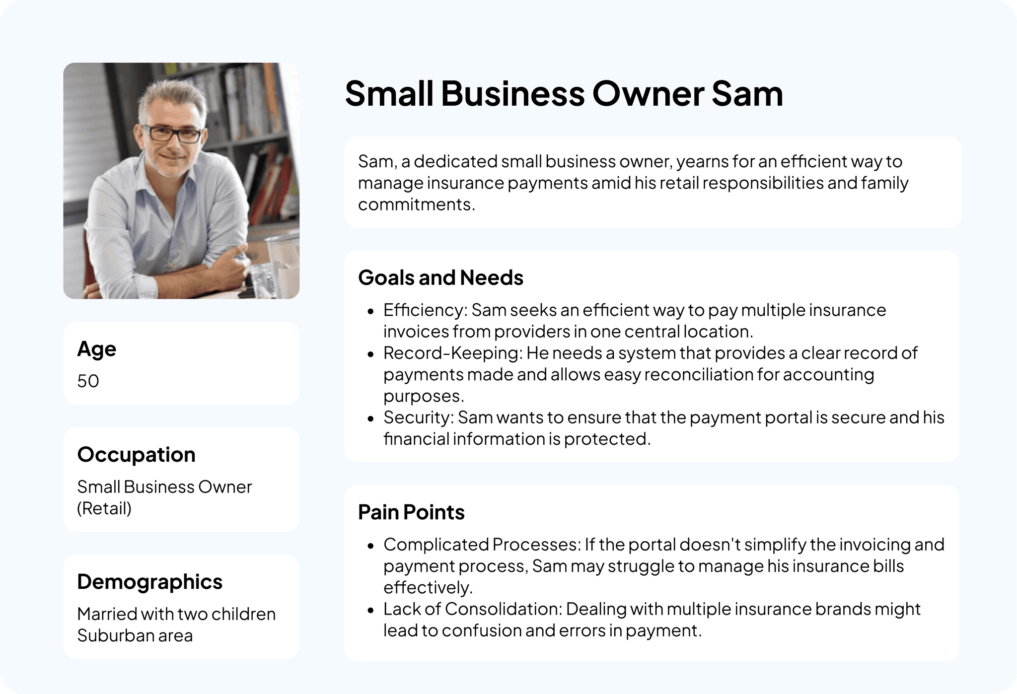
I created proto-personas based on the our interviews and the quantitate and qualitative analysis conducted. The customer base is quite varied, ranging from individual clients, to large corporations and people of varying technical abilities. The personas helped us to empathise with the customers and their needs, and allowed us to discover certain scenarios or tasks that may needed to be considered in the user journey.
With technical insights and customer perspectives in mind, how will the user experience unfold?
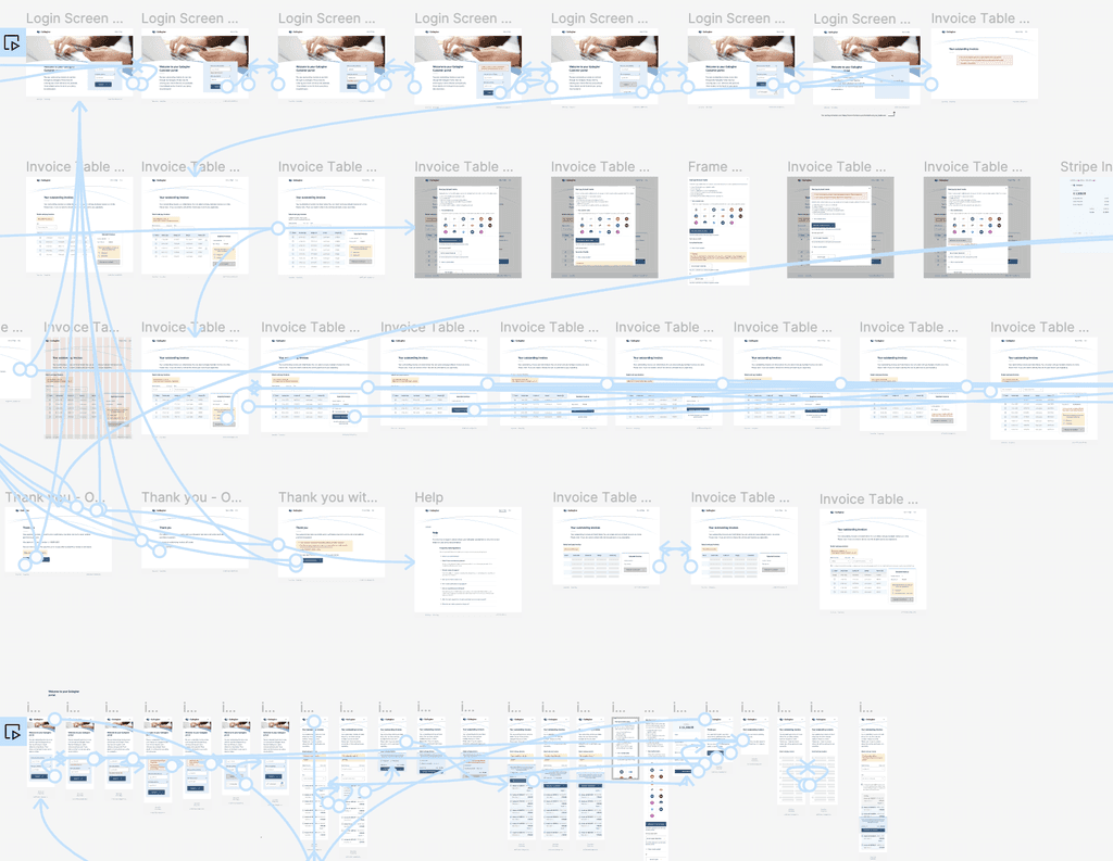
To look at the process from the customer's point of view, I created a user journey diagram to map-out how the portal will flow. This includes any potential scenarios outside the "happy path" that intend to guide users to avoid potential roadblocks. This process was then validated with the architects and stakeholders before proceeding with the screen designs.
🛠 Develop & ideate
Time to start visualising the payment portal
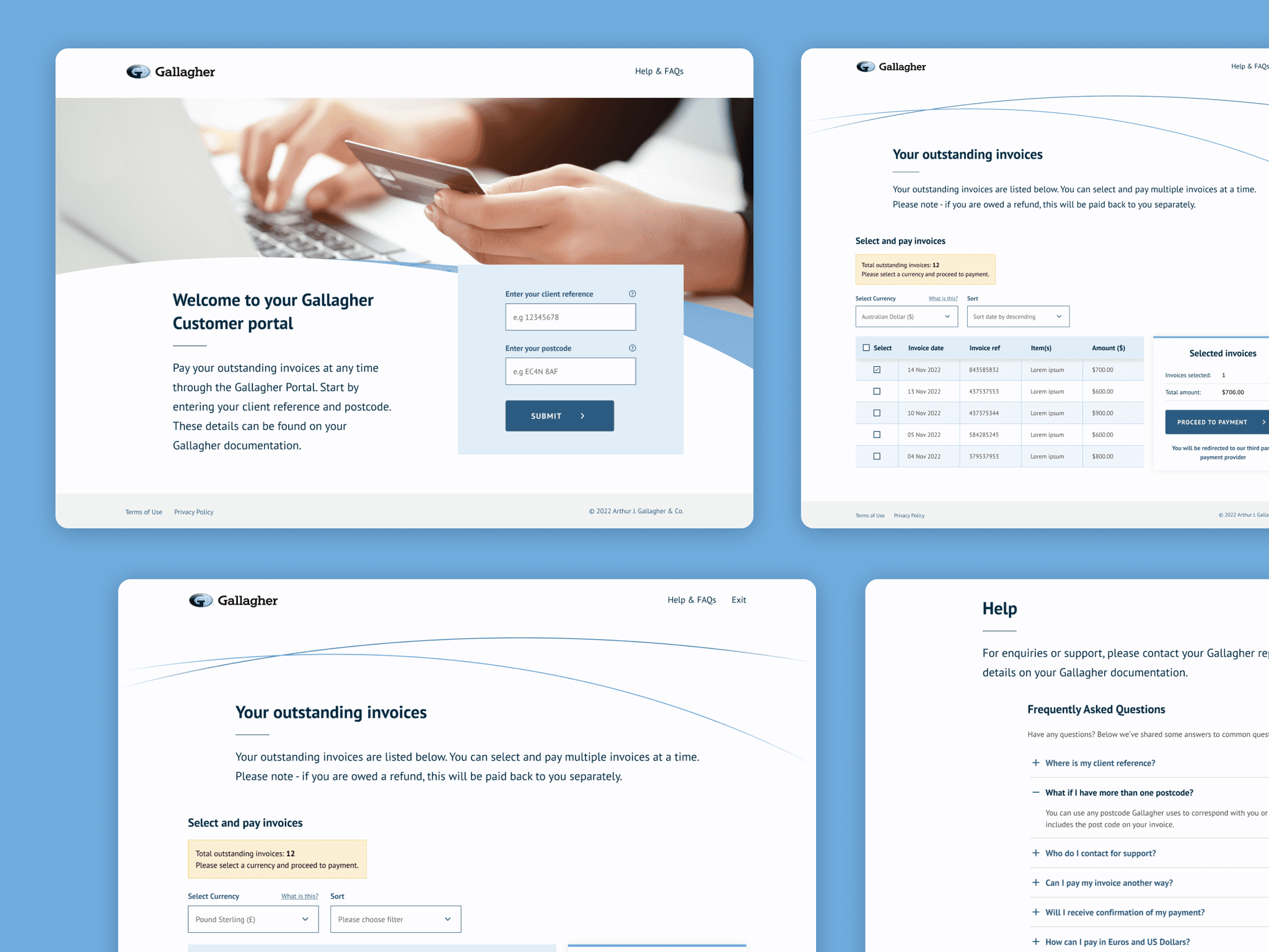
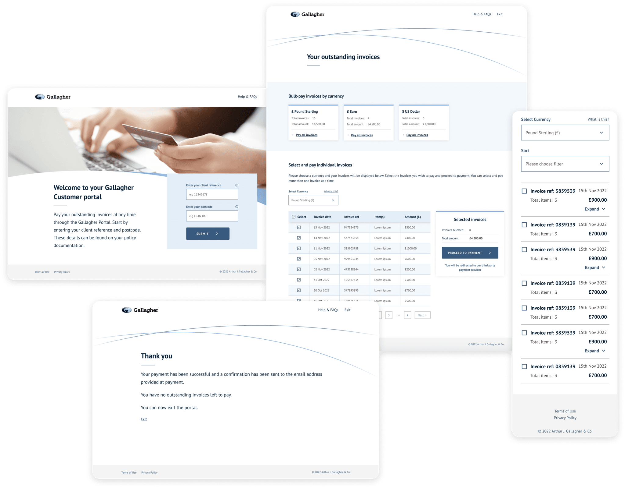
As the portal was going to be part of the Gallagher brand, we were required by the global branding team to carefully follow the brand guidelines and use their comprehensive Figma component library. With the component library at my disposal, this allowed me to quickly create and iterate on screen designs, meaning low-fidelity wireframing was not necessary.
Before we go any further, let's make sure these designs are feasible
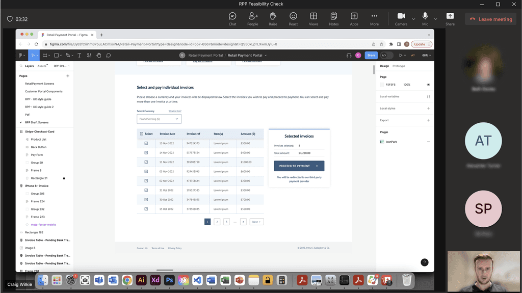
Throughout the screen design process, I collaborated with the developers and system architects to address any technical concerns and ensure the proposed solutions were feasible to build. This included regular feasibility calls and walk-throughs of the designs to show them how it would all work.
Prototyping will help us validate the designs
Once the designs were presented to the developers and passed feasibility checks, the prototypes were sent to the stakeholders to go through with members of the core team to test the designs.
🔄 Iterate & refine
Feedback on the initial prototype was positive, particularly praising its simplicity and ease of use. The designs were also presented to the global branding team to ensure it compliance good use of the component library.
🤔 But there are new challenges to solve
During the design process, we discovered certain constraints and technical limitations that had to be addressed. I worked closely with the developers and stakeholders to ensure the solutions had a good balance of usability, development feasibility and could be delivered within reasonable timescales. Some key problems to solve were:
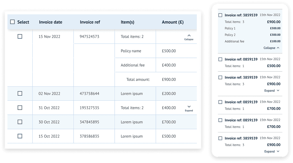
One invoice can have multiple policies
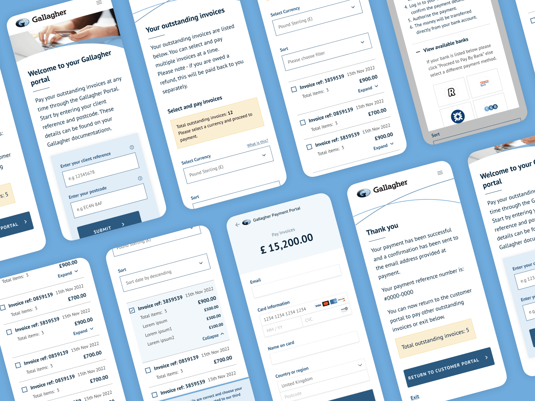
An invoice doesn't just have to be for a single item. In fact, there can be several different policies and items allocated to a single invoice. These cannot be paid separately. In order to keep things simple and avoid confusion and information overload, I designed an 'expand' option in the table allowing users to view a breakdown of each invoice with multiple items (where they apply).
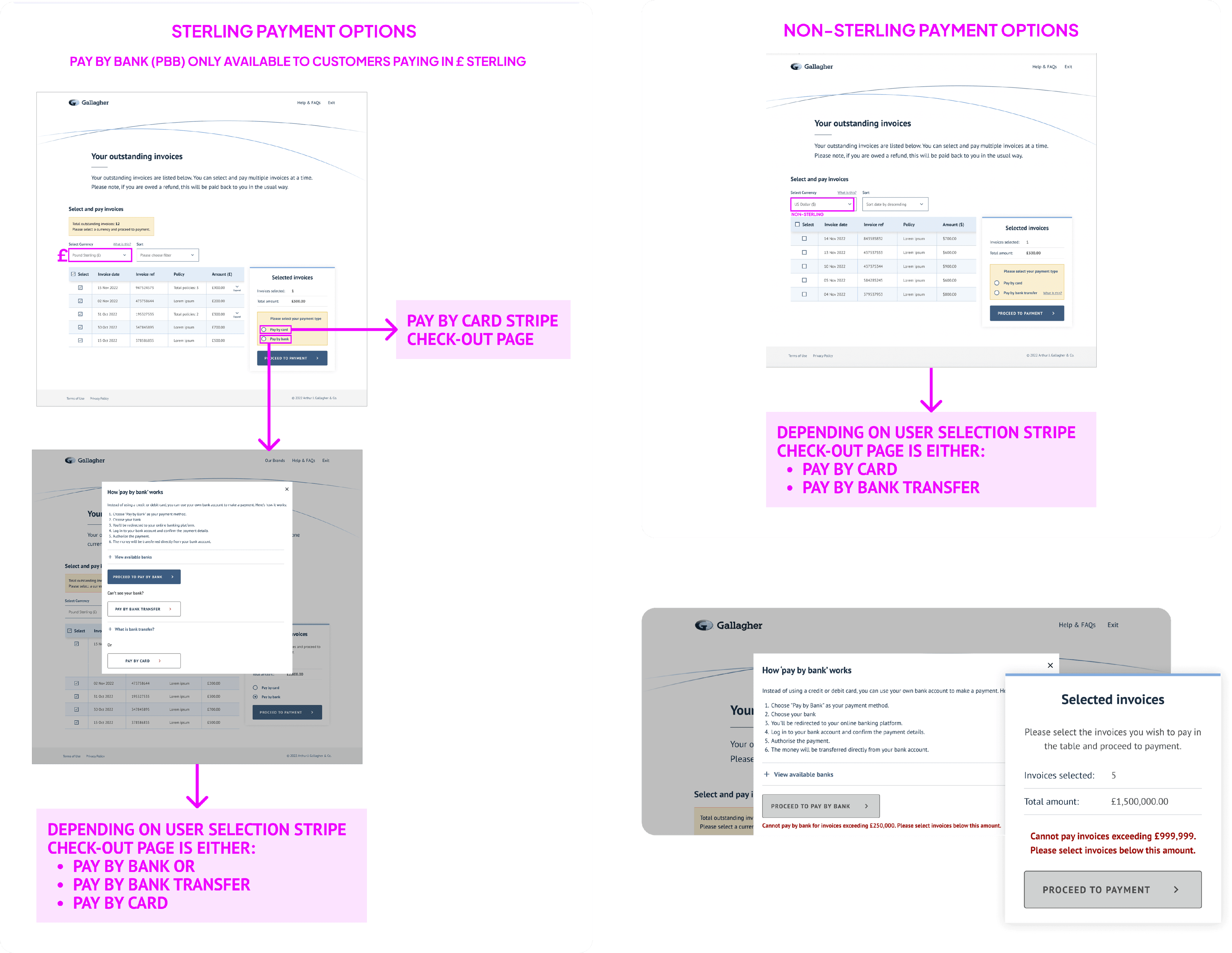
You can pay multiple invoices at the same time, but only for the same currency
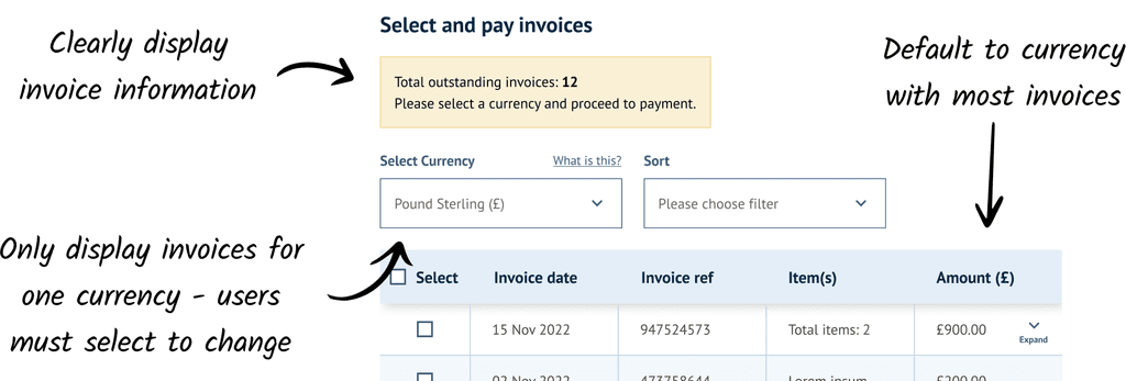
Due to a limitation with Stripe, payments can only be made in a single currency. This meant that although users can pay multiple invoices at once, it is not possible to bulk-pay invoices with different currencies.
A solution I designed was to only display invoices in a single currency in the invoice table. The invoice screen will default to the currency with the largest number of invoices, and users must select from the dropdown (refreshing the table) if they wish to pay invoices in another currency. This ensures a scenario of paying multiple invoices in different currencies cannot happen in the first place, avoiding any errors.
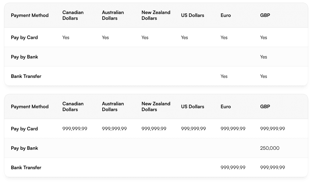
Payment method limitations with certain currencies
During our conversations with Stripe, we discovered certain payment methods only worked with certain currencies, and there were payment limits on each. This meant I had to ensure certain payment methods were only available for their compatible currencies in the UI.
In order to reduce frustration, I added messages that dynamically appear once users go above the payment limit, informing them of this. This ensures they can make any adjustments to the invoices they have selected before proceeding to payment and encountering an error.
I also had to adapt the flow to ensure that certain payment options were available for their respective currencies.
Legal requirements and explicit consent
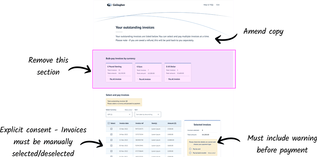
During the designs stage, we were advised by the compliance team that users had to give explicit consent to pay invoices. This meant we could not allow a "bulk pay" option as users had to see each invoice they have selected before proceeding to pay.
Bank Transfer payments take 2-3 days to update in the invoice admin software
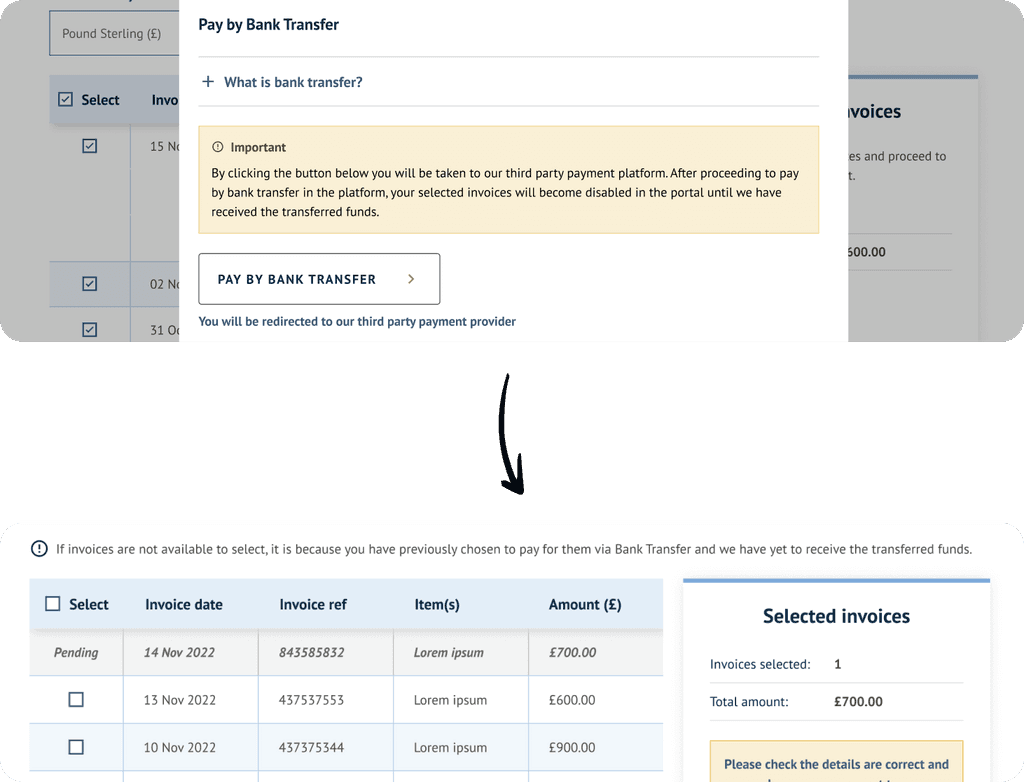
During testing, we found that bank transfer payments can take 2-3 days to reflect in Acturis. This can lead to confusion and potential duplicate payments while invoices remain 'outstanding'. To address this:
I revamped the information hierarchy, prioritising preferred payment methods: Pay by Card or Pay by Bank.
Introduced a 'point of no return' for bank transfers. In this, invoices are temporarily disabled after bank transfer selection, allowing Acturis updates. Users receive clear warnings and an added 'pending' status in the invoice table with a description.
🚀 Deliver
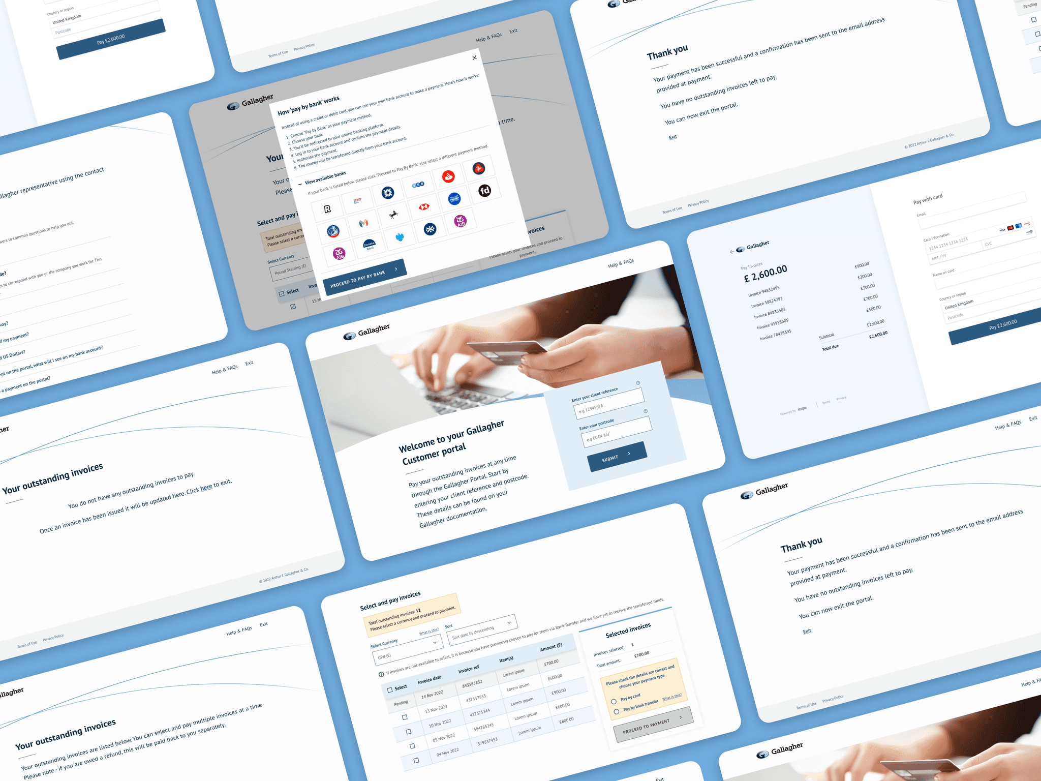
Handing-over to developers
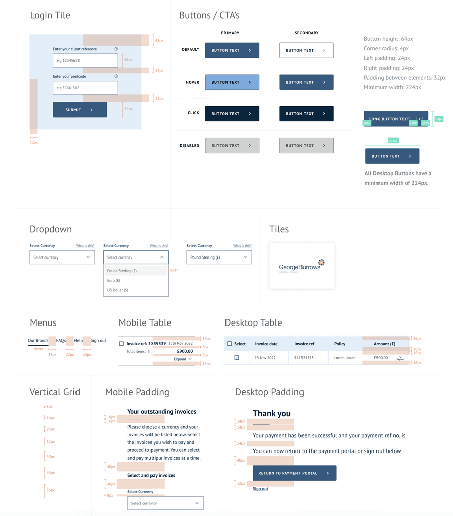
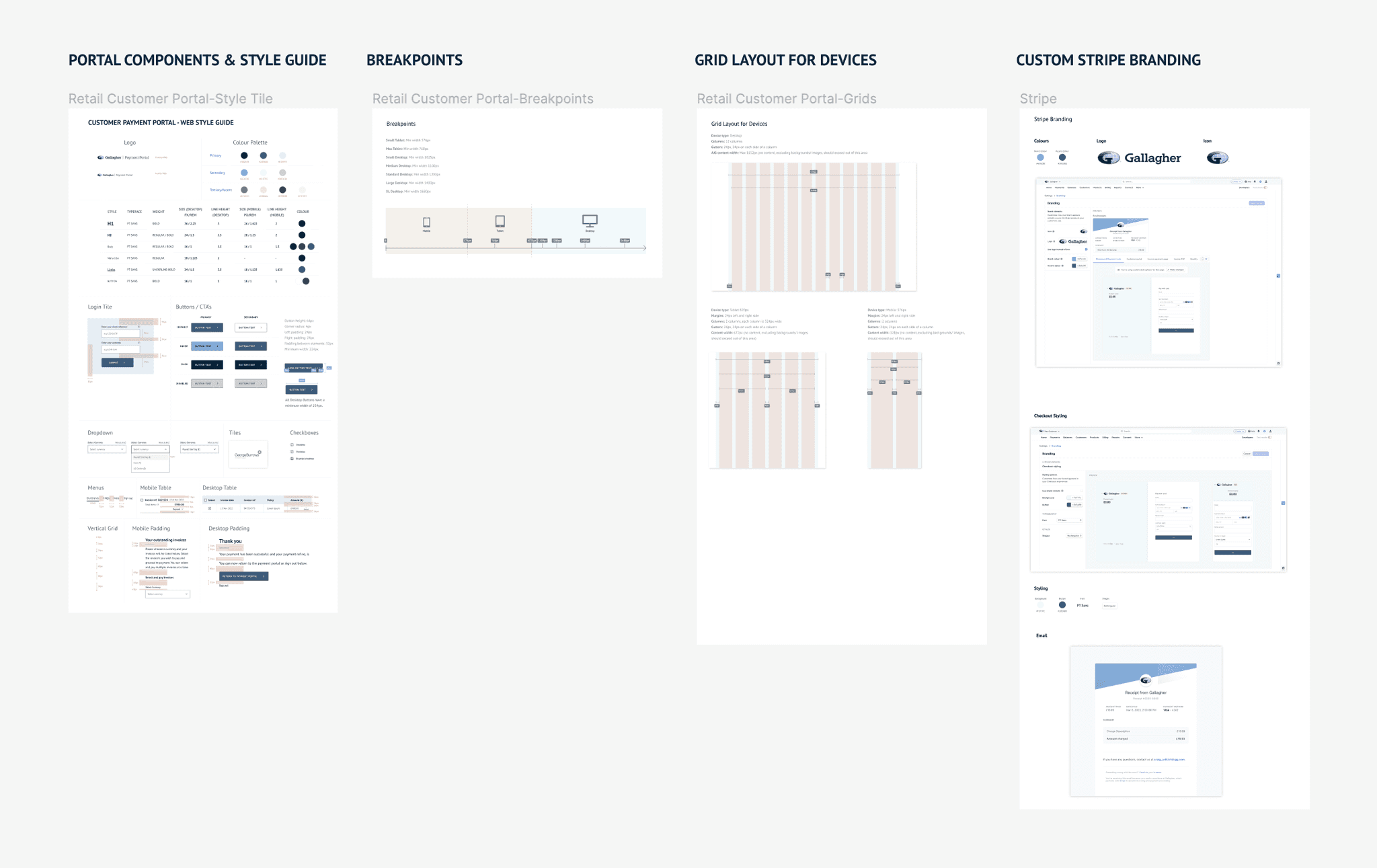
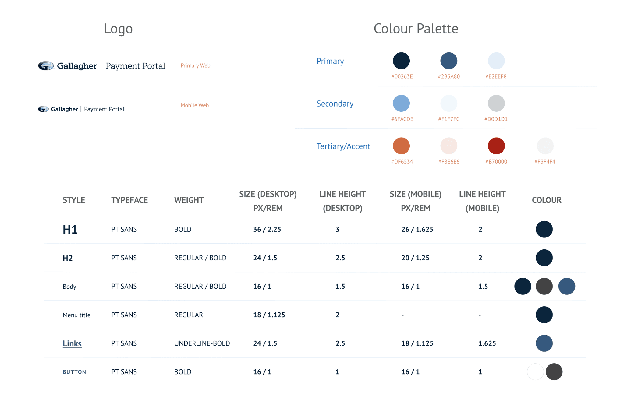
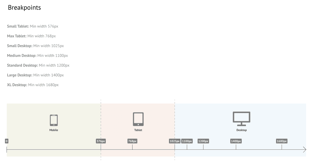
Once the designs were finalised, a comprehensive style guide with colours, fonts, dimensions and layouts was provided to developers, followed by a walk-through and Q&A.
So that's job done? Not quite. I still need to QC the system and provide front-end dev supervision
Throughout the development stages, I worked closely with the developers and testers to ensure the portal matched with the designs and branding. With my experience in front-end development, I was able to assist on providing solutions technical queries regarding the UI.
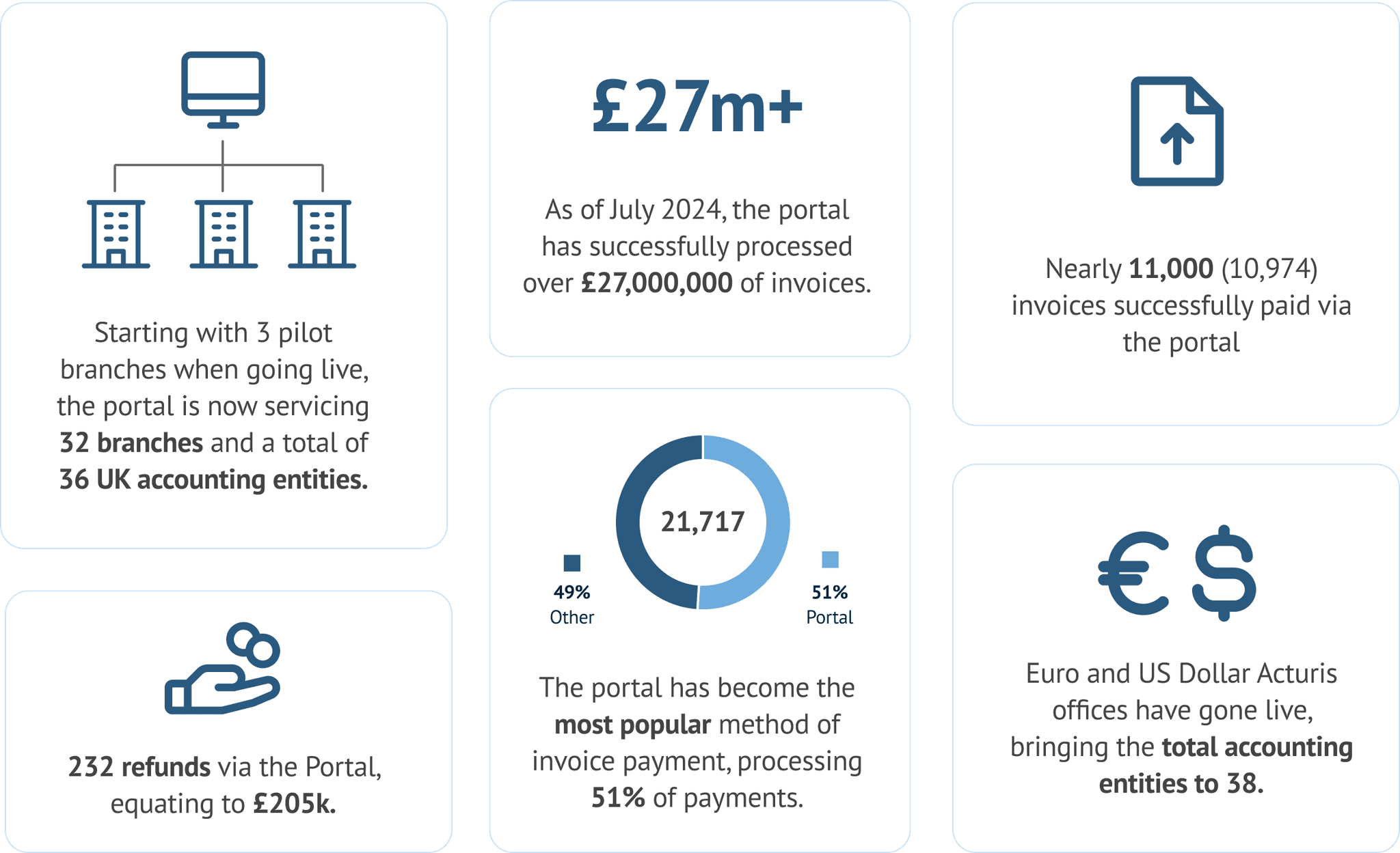
Since the project's delivery in September 2023 the portal has processed over £27 million in invoice payments. As a result of its positive feedback and success, the business are now expanding the portal across different brands to handle their customer invoice payments.
“Every site was really positive about how easy the portal is to use and how great it looks.”
- Olivia, Business Analyst
"Special thanks to you, @Craig Wilkie for handling our queries and design change requests patiently."
- Sadaf, Software Engineer
Feedback on accessibility
Efforts were made to ensure that the payment portal adheres to accessibility standards outlined in WCAG 2.1 guidelines. This involved attention to detail in areas such as contrast ratios and optimising site structure for seamless navigation via keyboards and screen readers. Here is feedback we received from a blind user:
"I’m delighted to say that I managed to pay the invoice via your portal! I was slightly concerned that it wouldn’t be accessible to my screen reader but thankfully it was. Thank you again for your time and attention it truly is appreciated."
- Customer who is blind and unable to use telephone service
Reflection
While the overall project has initially been a success, it would have been beneficial to conduct some usability tests to validate the designs form a user perspective. Unfortunately, we didn't have scope for this despite the UX team's recommendation.
What's next?
Google Analytics has been implemented to track user behaviour and pinpoint pain points as well as areas for growth. There is room for further inclusion of currencies and payment options. Possibilities exist for integration with more payment providers. Added language support for other nations is available.
