🌐 Overview
My role 👨🏼💻
Discovery and research
UI / UX design
QC
The problem 🤔
As a global insurance leader, Gallagher's expansion through acquiring smaller brands has posed a challenge. Many websites from acquired sub-brands don't meet Gallagher's security and branding standards. Addressing this issue by relocating or creating new compliant websites is a resource-intensive process.
Deliverables 📦
Figma component library
Design token architecture
Style guides
Specifications
The solution 🌟
To expedite website migration, we established a reusable component library comprising Gallagher-approved elements, built on a security-compliant CMS, Umbraco. Additionally, to enable effortless rebranding of these components and websites, we implemented a new design token architecture.
🔍 Research & Discovery
Who is this for?
This solution serves Gallagher, a prominent global insurance leader, and its diverse portfolio of sub-brands. These sub-brands specialise in insurance and risk management across a wide range of sectors, such as property, marine, automotive, and many more. Functioning autonomously within Gallagher, each sub-brand maintains its own brand identity and management team.
What are design tokens?
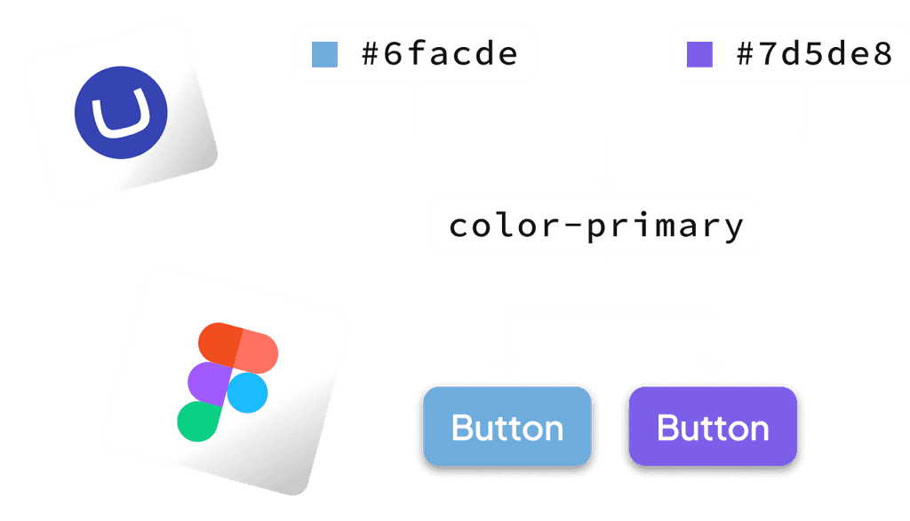
Design tokens can be thought of like 'nicknames' designers and developers use to define and communicate design elements. These range range from colours, fonts, and spacing. Instead of writing these design details directly into the code, we can use ‘tokens’, making it easier to keep the design consistent and make changes when needed. It's gives designers and developers a common language to talk about how things should look in a digital project.


Why do we need design tokens for our component library?
In order to speed up the migration and creation of websites on a secure, compliant CMS, a re-usable component library is being constructed on Umbraco. However, each Gallagher sub-brand adheres to their own distinct brand guidelines and colour palettes. By applying design tokens to individual components, it allows us to seamlessly update their 'theme' to fit new brands.
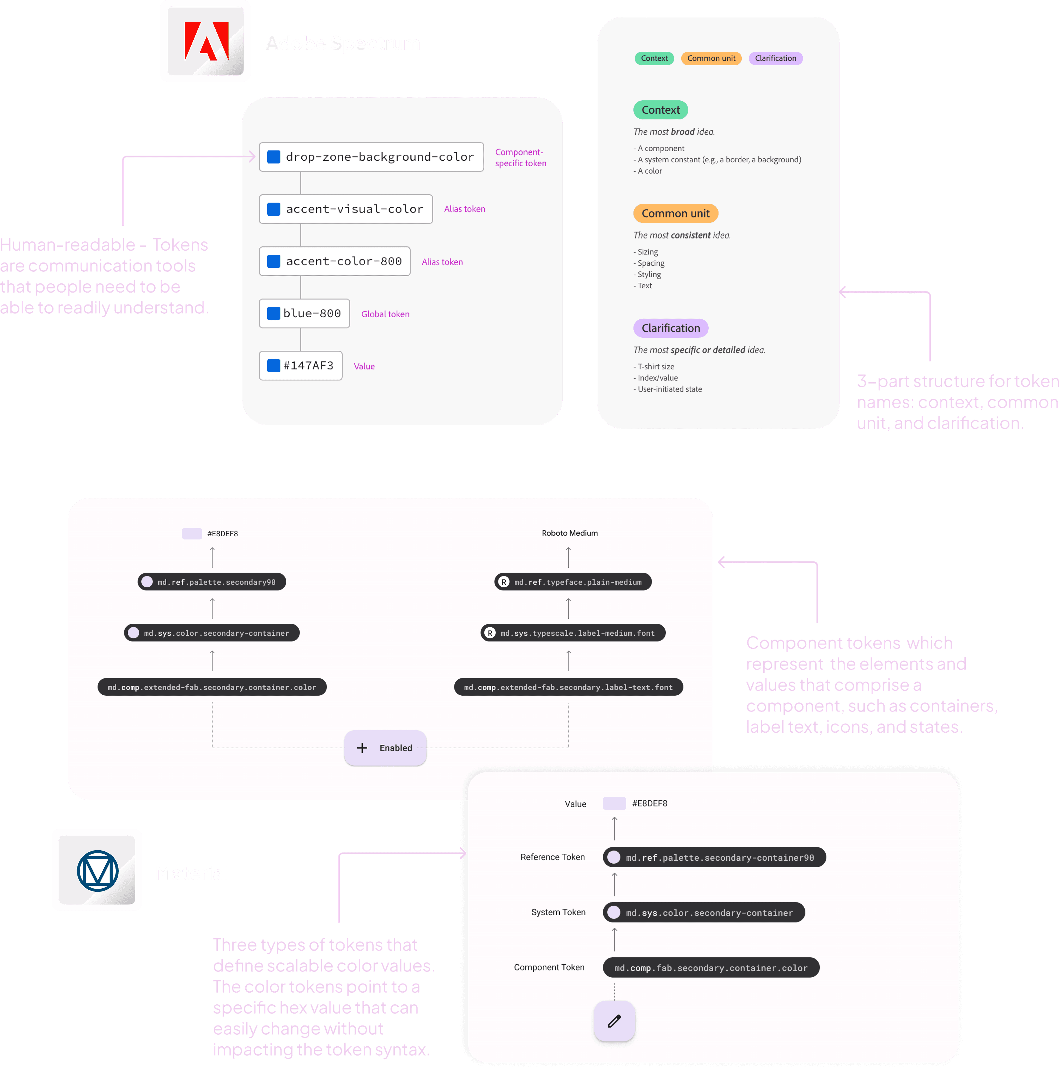
How can we use design tokens for our own component library? Let's look at some examples of existing token architecture.
By examining existing design systems and how they use tokens, such as Adobe Spectrum and Material, it allowed me to start thinking about how we can structure them for our own use case.
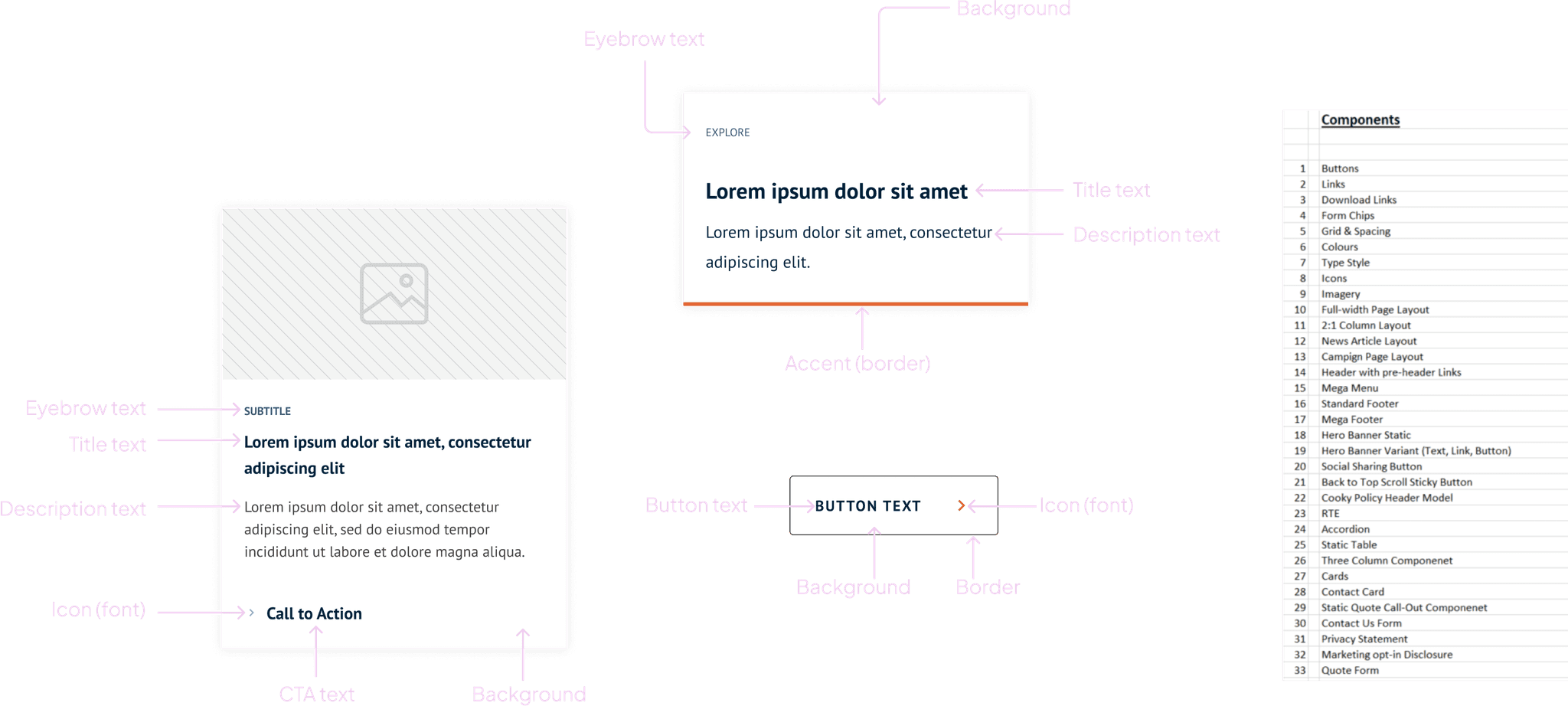
Identifying different elements within our own component library
In order to design the token architecture, I first needed to identify each of the different components that were going to be used in the MVP and explore their anatomy. The designs of these components are based on Gallagher's existing design system and component library.
🚀 Implementation
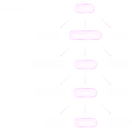
I'll start out by mapping out our structure
In order to make the design tokens as modular as possible, I organised the building blocks of the component styling into a hierarchical structure for their token architecture.
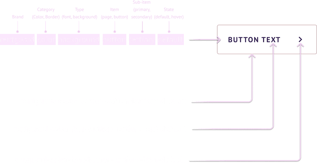
Let's see how this token structure will work with one of our components
We'll use a button to see how it can be styled using this design token structure.
Now we can apply this token structure in Figma using Variables
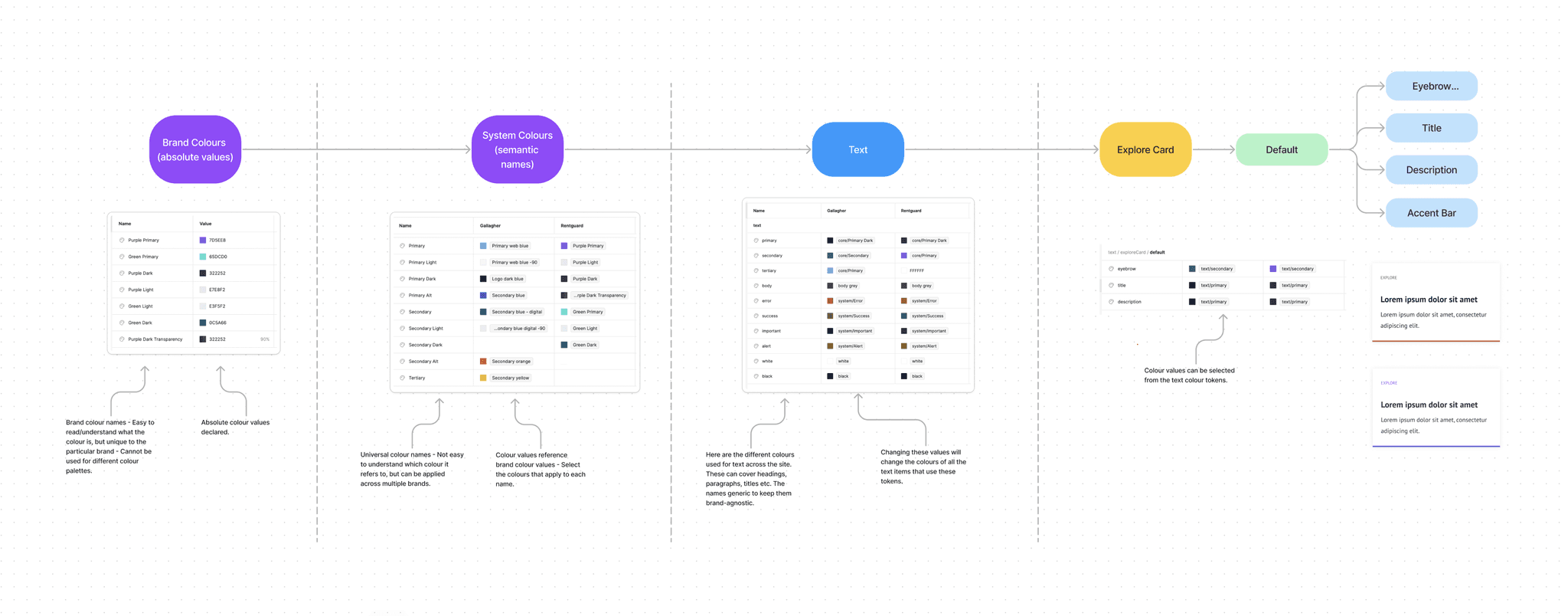
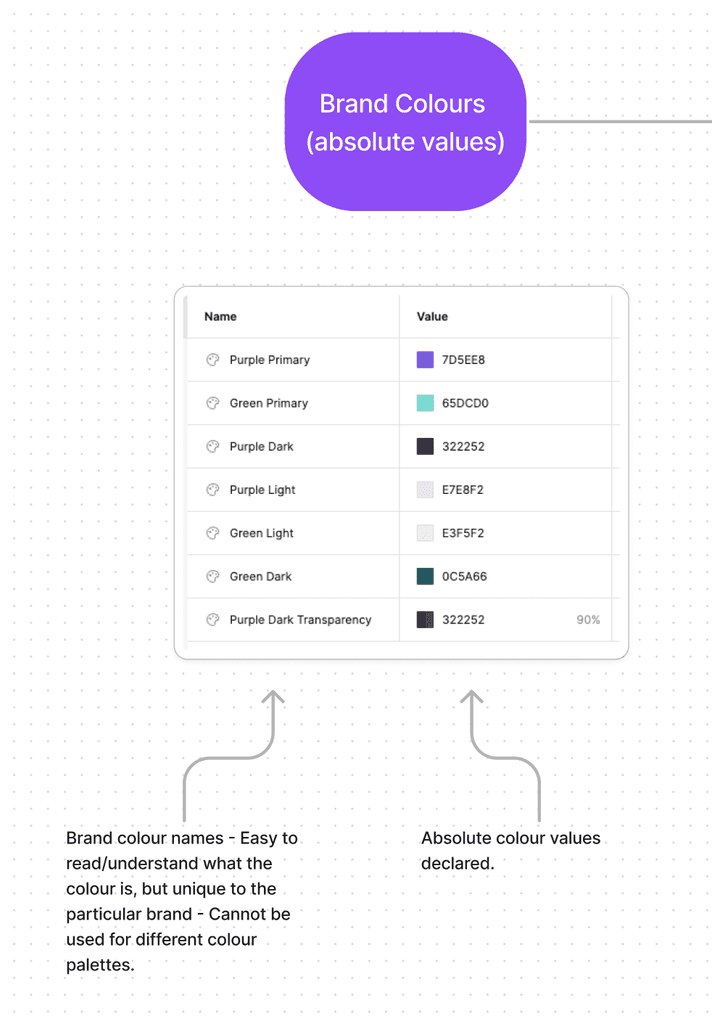
Step 1 - Adding our brand colours
The first step is creating a repository (or 'collection') where all of the brand colours are added with their names and absolute values. This allows us to easily manage and update colours for a brand exactly as they appear in their brand guidelines.
Step 2 - Creating a brand-agnostic colour library
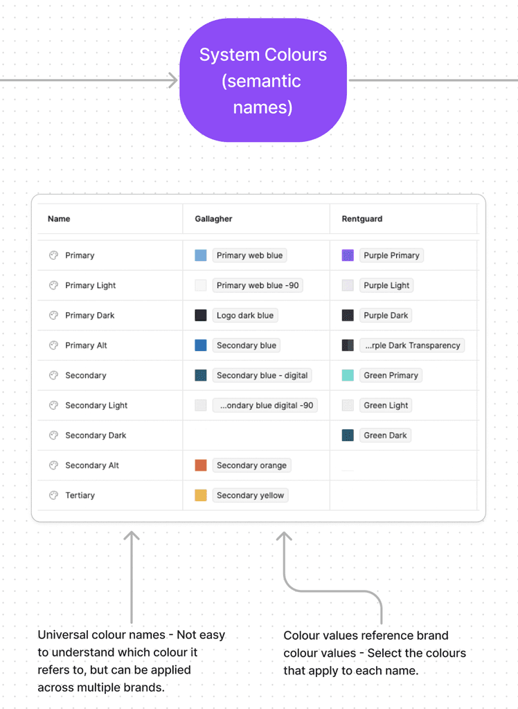
Next, I created a central colour collection for our component library which includes universal colour names. These are brand-agnostic and can be tailored to our components. I then matched up the colours from our brand collections to their relevant colour.
Step 3 - Create variables based on type
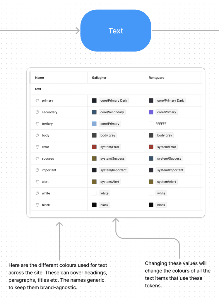
Next, I start creating variables for different types (i.e background, borders, text etc). These also maintain universal naming conventions so they're brand-agnostic, and colours will be applied based on context. For example, each brand only has a certain number of colours they used for text, so we can break these down based on their usage (Primary, Secondary, Tertiary etc.)
Step 4 - Items, sub-items and states
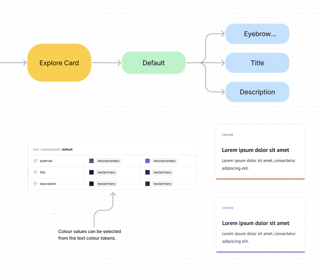
Finally, I created variables for specific items and sub-items that make up each component. For example, an 'explore card' component has eyebrow, title and description text types, so I assigned colours from the text library to each. These can also be divided up into states.
Modifying tokens
With the token structure being very modular, it's easy to modify colours to varying degrees of scale. For example, you can make a large change such as modifying the primary text colour across a whole site, or just changing the text colour for a specific item in a component.
Building the component library
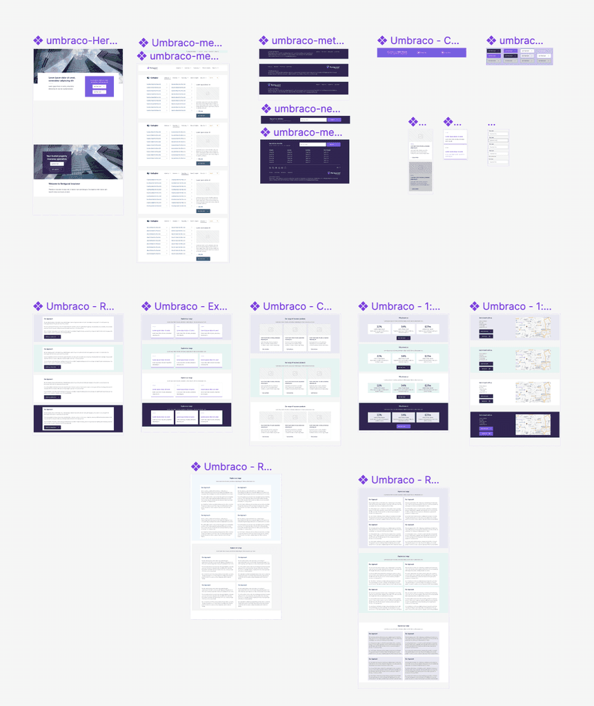
I then started to build out a new component library that is based on Gallagher's existing components. I then applied variables (token values) instead of colours to each of them, where the colours will be declared in the variable library.
Mobile responsiveness
In order to easily produce screen designs across all devices and assist developers in the building the components, I used Figma's 'auto-layout' feature to make the component library responsive.
🌟 The result
After applying this token structure to all the components in the Figma library, it allows for easy and seamless rebranding.

Let's apply the token architecture to our Umbraco component library
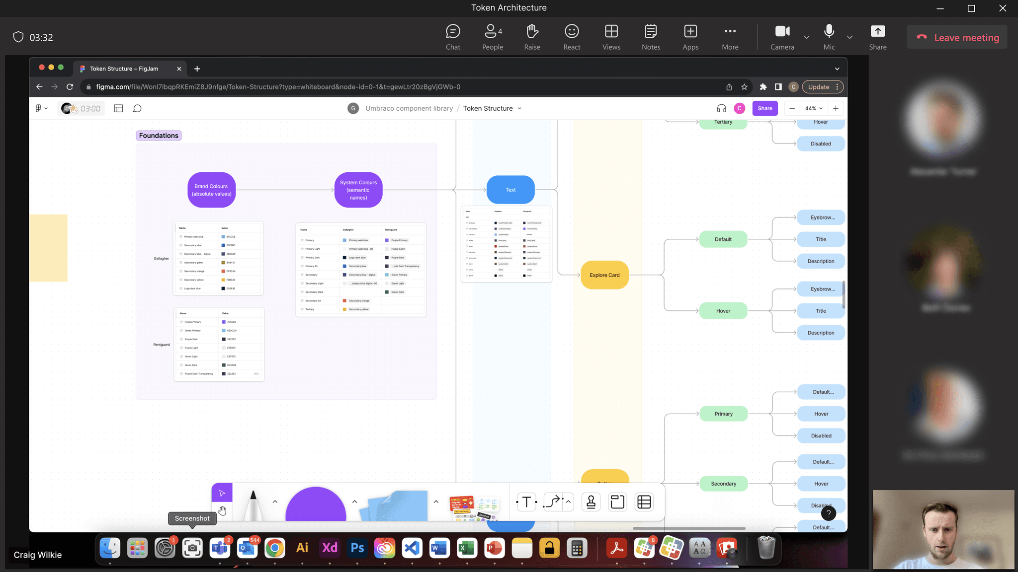
Developer walk-through
To check the feasibility of the token architecture when applying to to the Umbraco component library, I did a demonstration of how it all works in Figma.
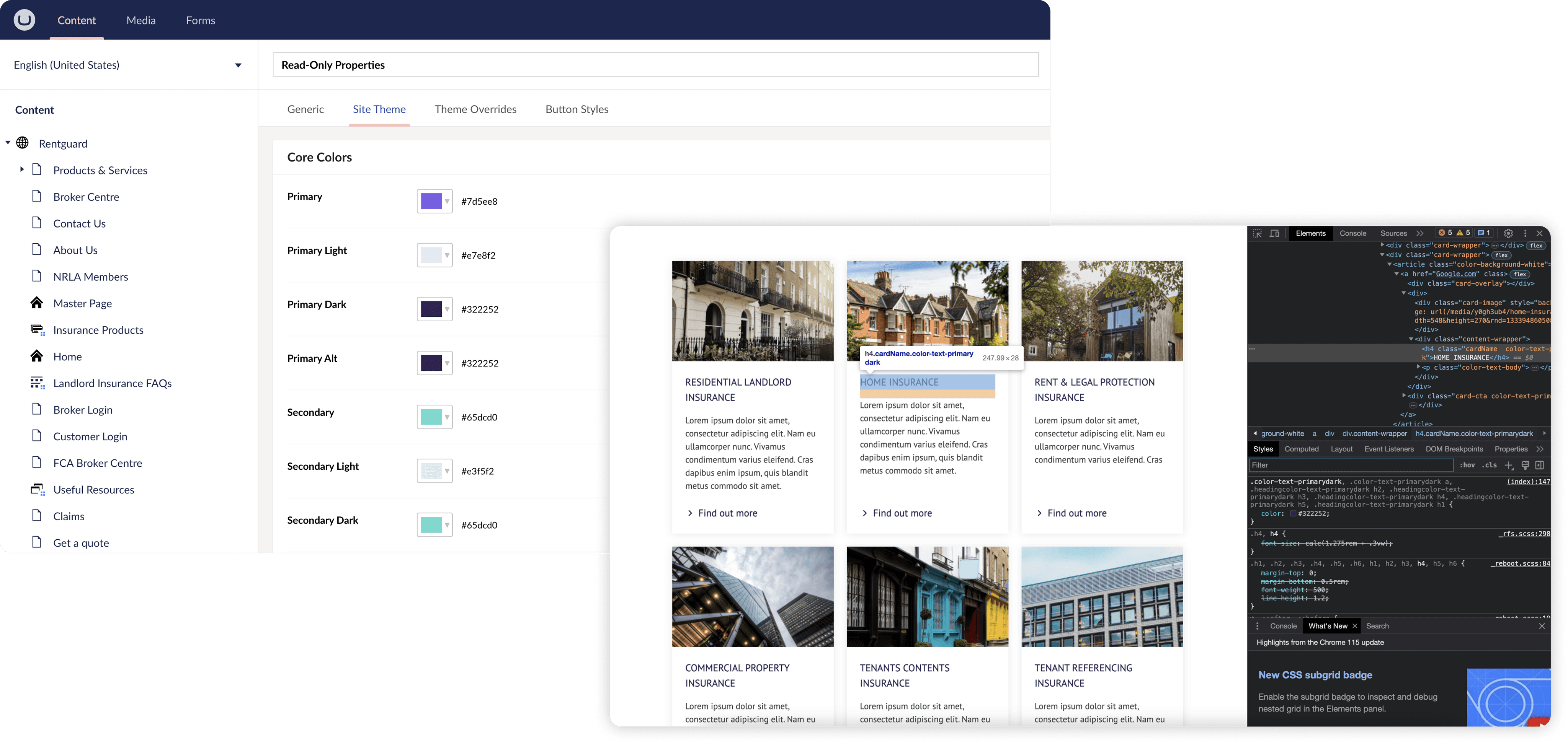
Let's understand how things currently work on Umbraco
When adapting the token architecture to Umbraco, I first analysed how the current CMS is used when changing colours for components.

Now we need to redesign it to suit our token structure
Together with the lead designer and the developers of the re-usable component library project, we proposed a new flow of managing and updating colours in the CMS.

Testing the new architecture
After working with the developers, the new token structure was implemented and ready for testing. We tried applying different styles, new brands and looked for any. Any were then raised with the developers.
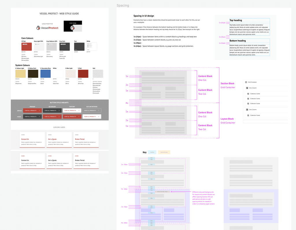
Style guides for developers
In order to make things easy when on-boarding a new brands to the component library, style guides have been made showing their respective colour tokens. Spacing guides were also made for the component library using an 8pt grid system.
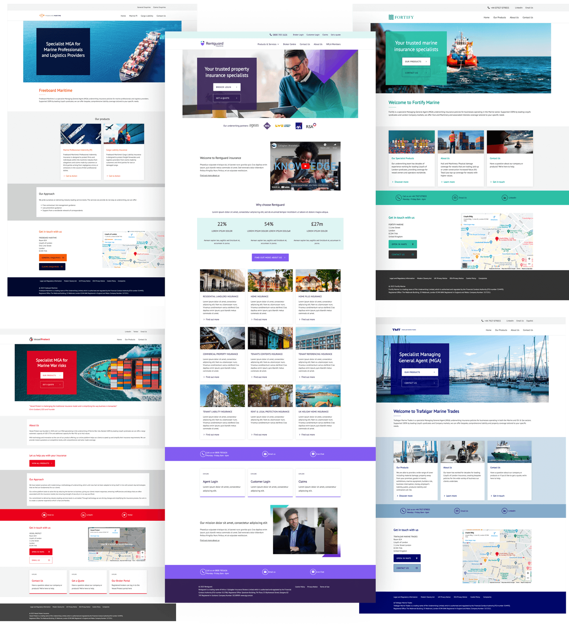
🌟 The result
Once the component library MVP was ready along with its working token architecture, we managed to design and build five sites in Umbraco for new brands within 2 months. This has saved potentially a year's worth of productivity.
Final thoughts
The MVP has so far proven to be a successful project, already enabling the on-boarding and creation of new sites for brands in a matter of weeks instead of months. With it being an MVP, it is still quite limited in the number of components and customisability available. This has resulted in some minor frustration with some stakeholders who want more options and styles closer to their existing sites, however they are happy with the speed and hassle-free process in which their site can be migrated across to a secure platform.
What's next?
With this still being in an MVP stage, there is plenty of scope to introduce font and spacing token architecture. This will help add further customisability in the CMS and allow us to tailor sites to match their branding even further.
